31 best SaaS ads in 2026: examples that convert


B2B SaaS digital ad spend is on track to hit roughly $48 billion by 2026, per eMarketer — but the money doesn't spread evenly. AppsFlyer found the top 2% of creatives pull 43% of spend across the ad accounts it studied. You don't need a bigger budget to join that 2%. You need a winning ad — and the fastest way to one is to start from a SaaS ad that already won. Below are 31 of the best SaaS ads running right now, broken down by why they convert, with how long each one actually ran as the proof — plus where to run SaaS ads, and what each platform costs.
What makes a great SaaS ad
SaaS sells something invisible, so the best SaaS ads do one job: make the value legible in under two seconds. Five patterns show up again and again across the examples below.
- Show the product doing the job. A screenshot of the interface mid-task beats an abstract illustration of "productivity." The viewer sees themselves using it.
- One line of positioning beats a feature list. "One app to replace them all" lands; a bulleted spec sheet scrolls past. Pick the single claim and commit the whole frame to it.
- A pain-specific hook beats "boost productivity." Name the exact problem — slow web projects, scattered tools, a homework wall at 11pm — and the right reader stops scrolling.
- Put the proof in the ad, not just the landing page. Review stars, a customer count, a named co-brand, or a hard stat does the convincing before the click.
- Ask for one low-friction thing. "Get started for free," "download the report," "get a demo." One ask, low commitment, matched to where the buyer is.
Creative quality is not a vanity metric for SaaS. The median company now takes 18 months to earn back its customer acquisition cost, up from 14 (Benchmarkit). A cheaper, better-converting ad is the difference between a payback period that works and one that doesn't.
Best SaaS Facebook and Instagram (Meta) ad examples
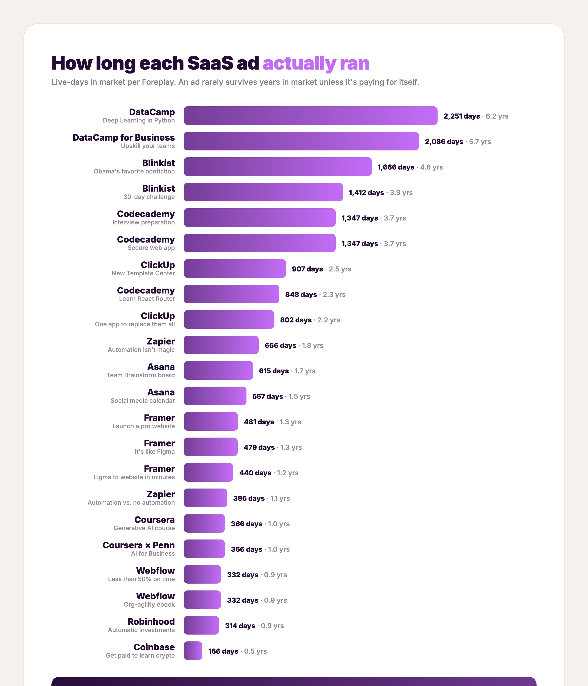
Meta is where most software and subscription apps test creative, because it's cheap to fail fast: the average cost per click is $0.70 for traffic and $1.88 for lead-gen campaigns, with the technology vertical around $1.27 (WordStream). The 31 ads below span B2B SaaS and consumer-subscription apps — all selling access to software — and double as a working swipe file of SaaS Facebook ads. They are grouped by brand and ordered roughly by how long each ran in market. Run times come from Foreplay's ad-library data — first seen to last seen live, pulled June–July 2026. A handful of entries are newer pulls without a day count; where a number is missing we say nothing rather than invent one. An ad rarely survives years in market unless it's paying for itself, so read the longest-running ones as the closest thing to a proven template you'll find. For more static layouts in this exact format, see the Facebook static ad examples breakdown. Going B2B specifically? The B2B SaaS ad examples spin-off groups 18 ads by the job each does.
1. DataCamp — One promise, zero clutter

A dark neural-network visual, three words bottom-left: "Deep Learning in Python." No feature list, no logo wall, no offer. This ad ran for roughly 2,251 days — over six years — the single most durable ad in this entire roundup.
Restraint is the lesson. DataCamp matches one course to one searchable intent and lets the topic do the targeting. When you know exactly who you want, the ad doesn't need to say more than the thing they already want to learn.
Clone it: the DataCamp layout is in the AdDogs library — swap the topic, keep the calm.
2. DataCamp for Business — The same formula, aimed at teams
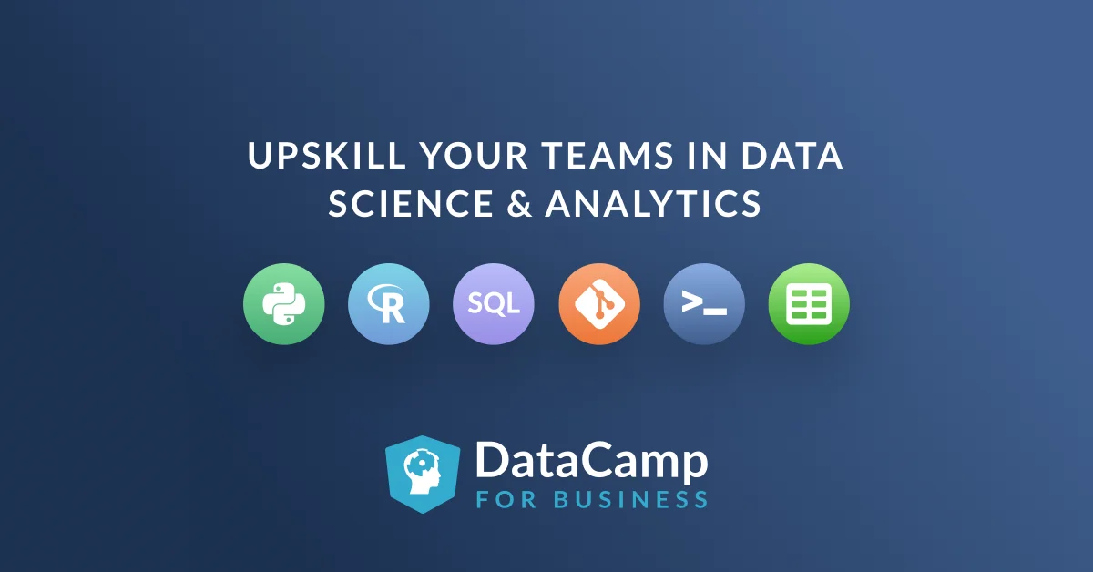
"Upskill your teams in data science & analytics" over a row of data-tool icons — Python, R, SQL, Git, the terminal, spreadsheets — and the DataCamp for Business logo. Roughly 2,086 days in market, second only to its consumer sibling above.
Same restraint, plural audience. DataCamp re-aimed the exact system from ad #1 at the manager who holds the training budget, swapping one course title for a team-level outcome. Two of the most durable ads in this roundup are one layout pointed at two buyers — a creative system, not a lucky one-off.
Clone it: the DataCamp skill-icons layout is in the library — list your integrations, state the team outcome.
3. Blinkist — A challenge that proves the value
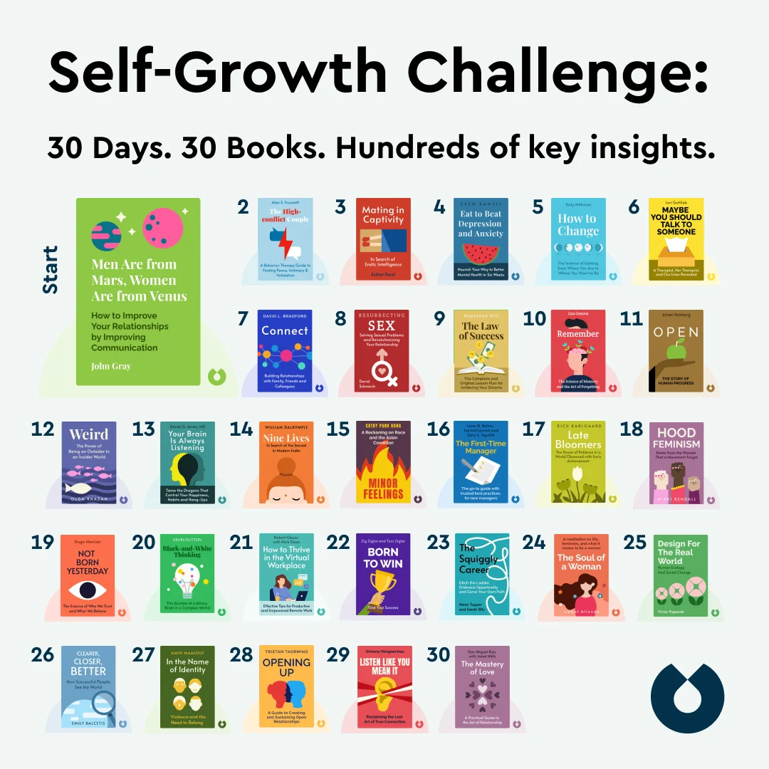
"Self-Growth Challenge: 30 Days. 30 Books. Hundreds of key insights." A tidy grid of 30 numbered book covers fills the frame. Roughly 1,412 days live.
That grid is the argument. Instead of claiming Blinkist saves you time, the ad shows 30 books you'll actually get through, which makes the abstract promise ("learn faster") concrete and countable. Volume, laid out visually, reads as value.
4. Blinkist — Borrowed authority, zero product shot

An editorial photo of Barack Obama reading on a couch — no interface, no book grid, no logo lockup. Its angle: his favorite nonfiction, summarized on Blinkist. Around 1,666 days live.
No product appears in this ad at all — and it outran almost everything here. A familiar face mid-read does the persuading, the editorial framing reads native in the feed, and curiosity carries the click. Borrowed authority is the fastest credibility a subscription app can rent — provided the association is real enough to survive scrutiny.
5. Codecademy — Sell the interview, not the course
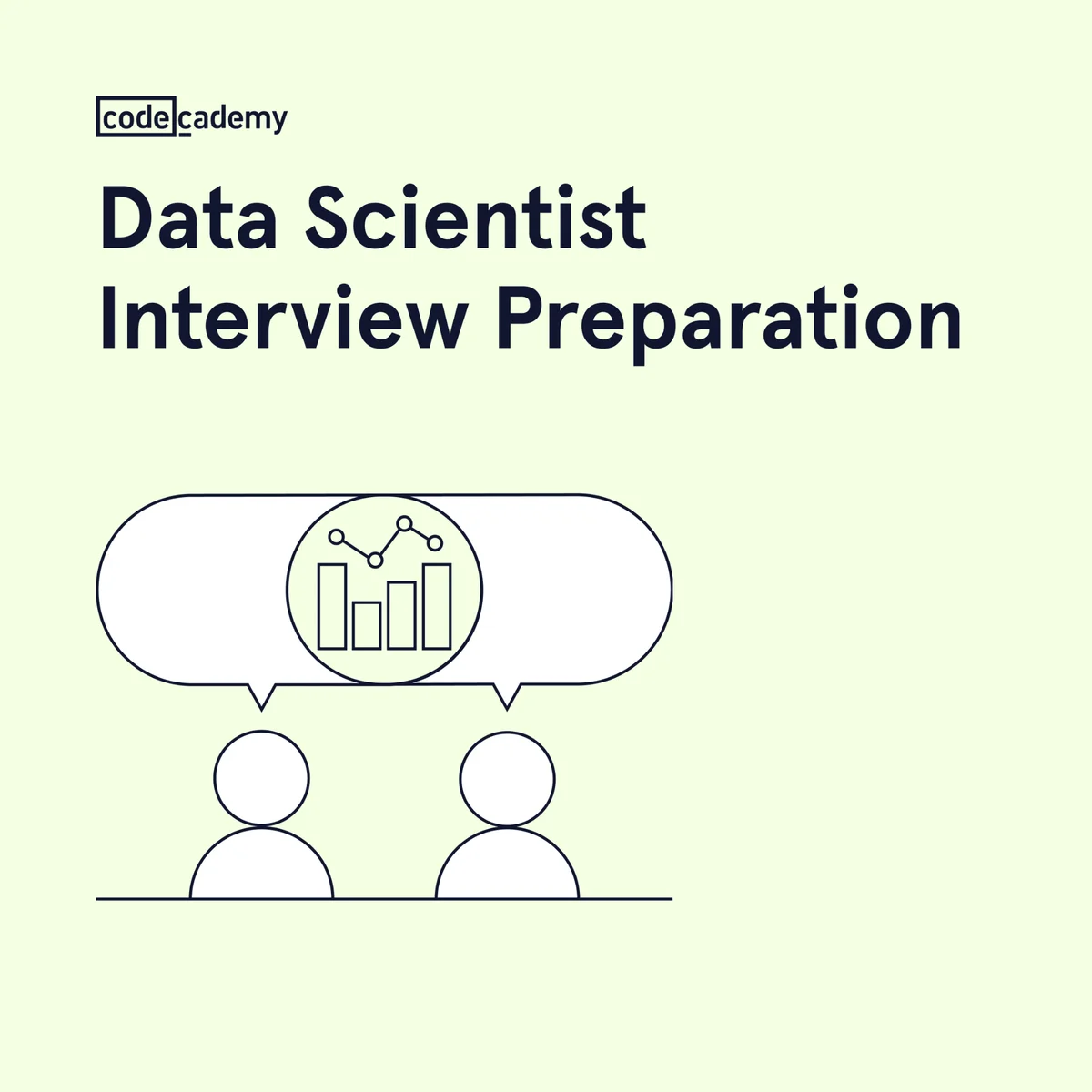
"Data Scientist Interview Preparation" and a two-figure line illustration with a chart in the speech bubble. About 1,347 days running.
Codecademy names the moment of maximum anxiety — the interview, not the curriculum. "Learn data science" is a category — "ace your interview" is an outcome with a date on it. Name a more specific moment and your ad competes with fewer rivals for that reader.
Clone it: the Codecademy interview-prep layout is in the library — name the moment your buyer is preparing for.
6. Codecademy — A niche promise in a human scene

"Build a more secure web app" over a photo of a developer with the actual course open on his laptop. Also roughly 1,347 days in market.
Codecademy narrows the promise deliberately — not "learn to code," but ship a more secure app — and the lifestyle photo carries the product demo inside it (the screen shows the real course). Niche promise plus human context is how a broad platform advertises a single course without flattening it into a slogan.
Clone it: the Codecademy lifestyle layout is in the library.
7. Codecademy — Show the project you'll build
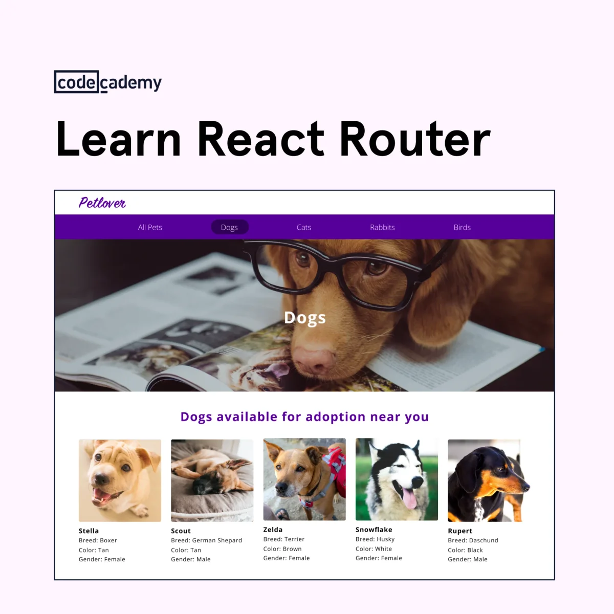
"Learn React Router" over the Petlover pet-adoption app — the project students build in the course, complete with a dogs-available-near-you grid. About 848 days live.
Show-the-output, taken to its logical end: the ad is a screenshot of what you'll have made by the finish. For any product whose result is visual — a site, a dashboard, an app — the finished artifact is the most honest creative you can run.
Clone it: the Codecademy project layout is in the library — put your customer's end result in the frame.
8. ClickUp — Make a feature launch feel like news
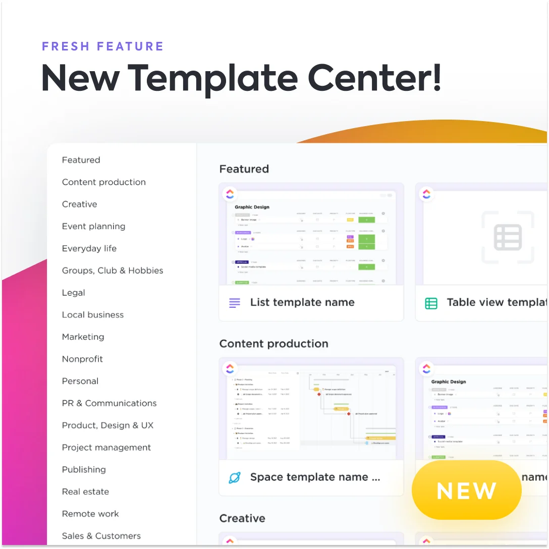
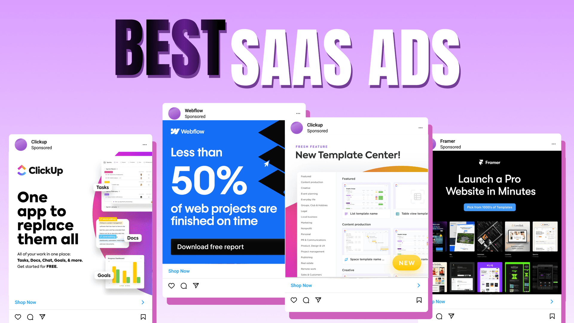
"Fresh Feature: New Template Center" over a screenshot of the template gallery, with a yellow "NEW" badge. About 907 days running.
Framing a feature as news gives an existing audience a reason to come back without a discount. The product screenshot does double duty — it announces the feature and demonstrates it in the same glance.
9. ClickUp — One line that swallows the category
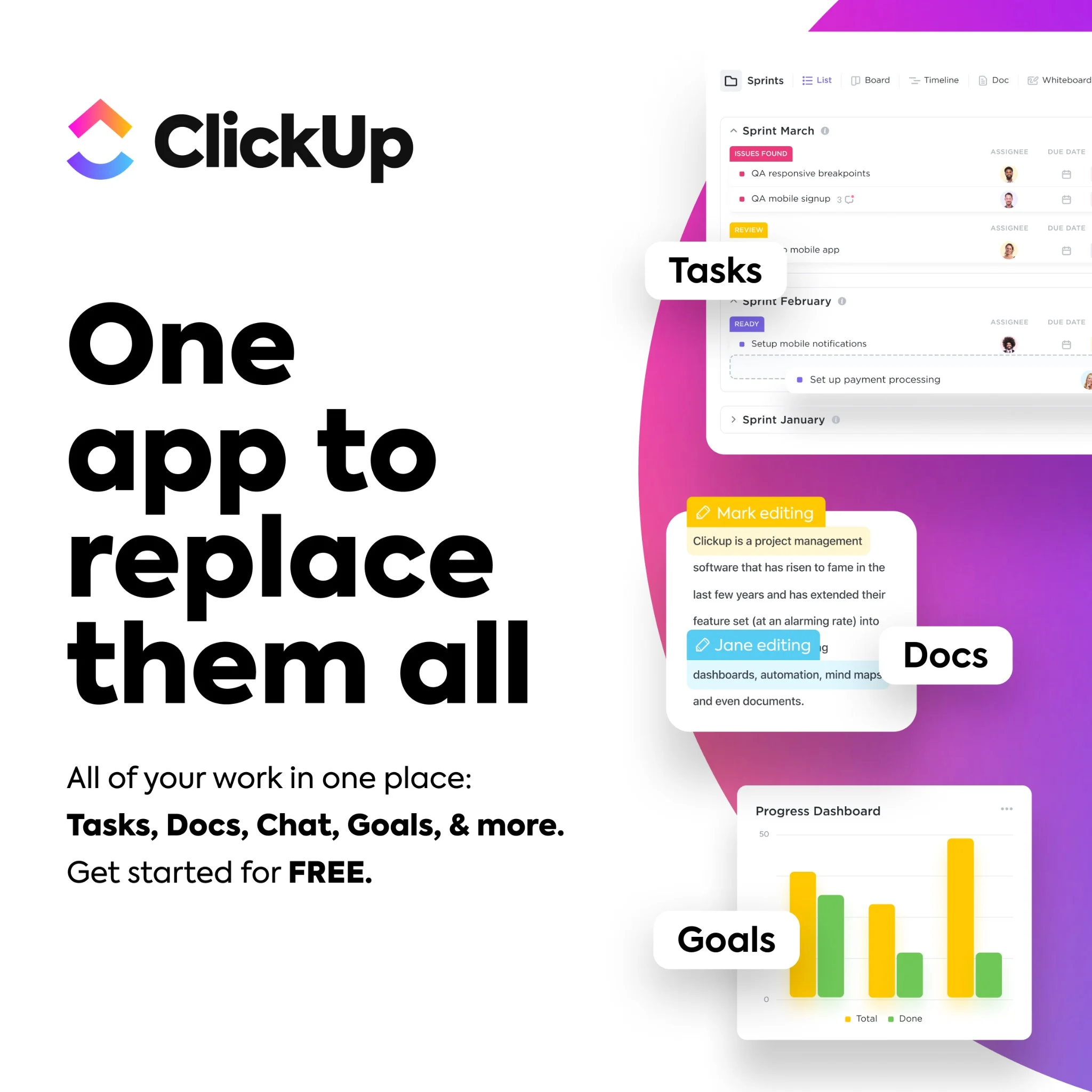
Giant black type: "One app to replace them all." Product panels float on the right labeled Tasks, Docs, Goals. Subhead: "All of your work in one place." CTA: "Get started for free." Around 802 days live.
Positioning compressed to seven words. It frames every competing tool as clutter and ClickUp as the consolidation, then de-risks the click with a free start. A headline that takes a position strong enough to disagree with is exactly why it works.
Clone it: the ClickUp all-in-one layout is ready in the library — write your one line, drop in your UI.
10. Zapier — The product is the hero shot
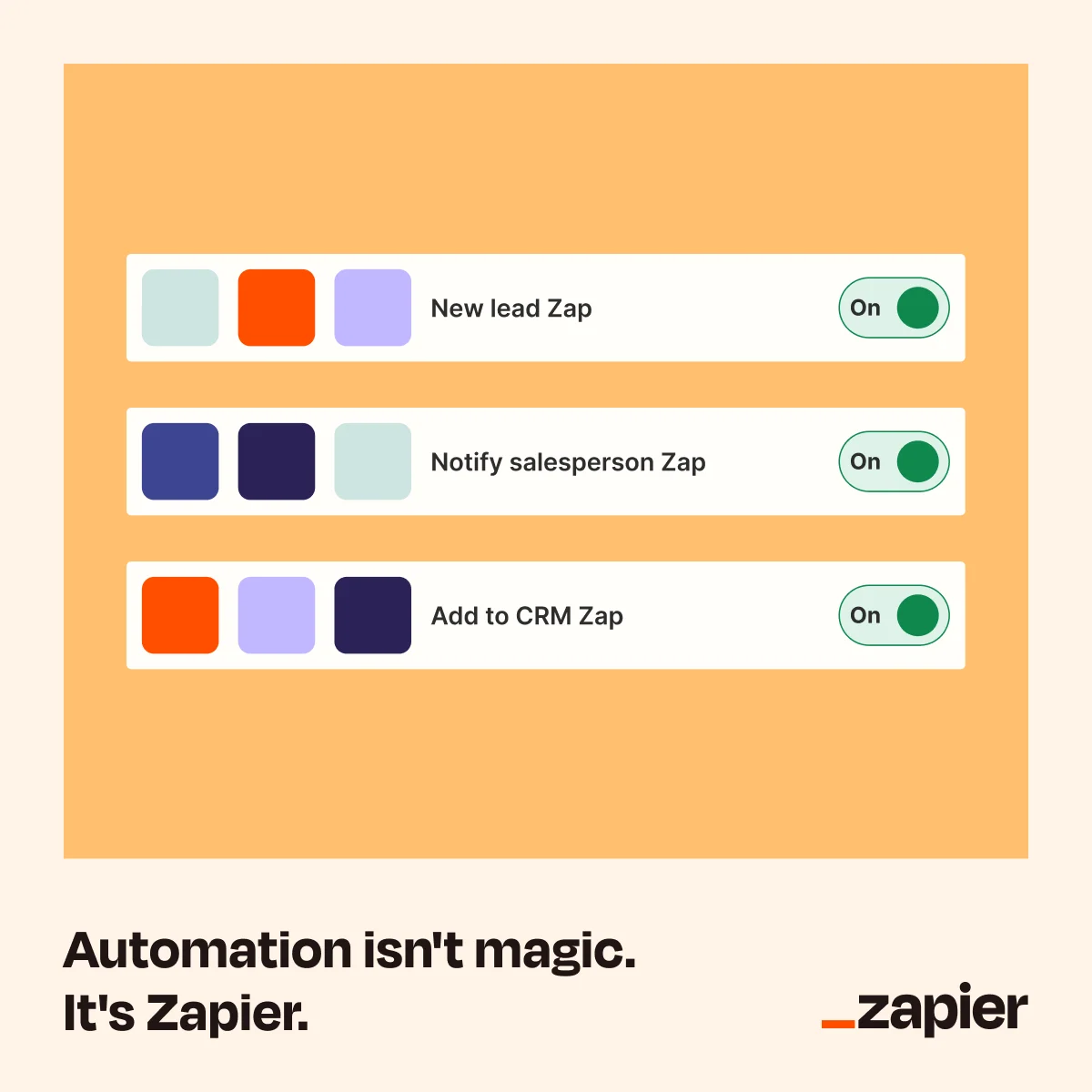
Three "Zap" rows — New lead, Notify salesperson, Add to CRM — each toggled On, above the line "Automation isn't magic. It's Zapier." Roughly 666 days running.
Zapier sells an abstraction (workflows between apps) by rendering it as something you can see and toggle. The tagline preempts the objection that automation is complicated, and the mock interface makes "on" feel like one click away.
Clone it: the Zapier automation layout is in the library — drop in your product's interface.
11. Zapier — Compare against the status quo, not a rival
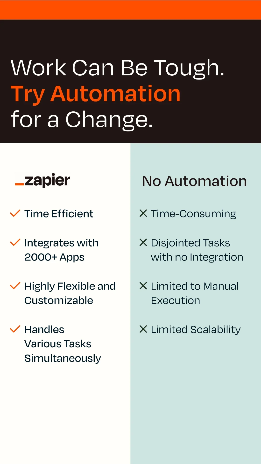
"Work Can Be Tough. Try Automation for a Change." Below, a two-column table: Zapier with four green checks (time efficient, 2,000+ app integrations, flexible, parallel tasks) against "No Automation" with four crosses. Roughly 386 days running, in a vertical Portrait (9:16) frame built for Stories.
Zapier's competitor here is manual work — an opponent that can't complain and that every reader already resents. Check-versus-cross scanning does the arguing in under a second, no reading required. When you'd rather not name a rival, the status quo is the safest thing to beat.
12. Asana — Sell the template, not the tool
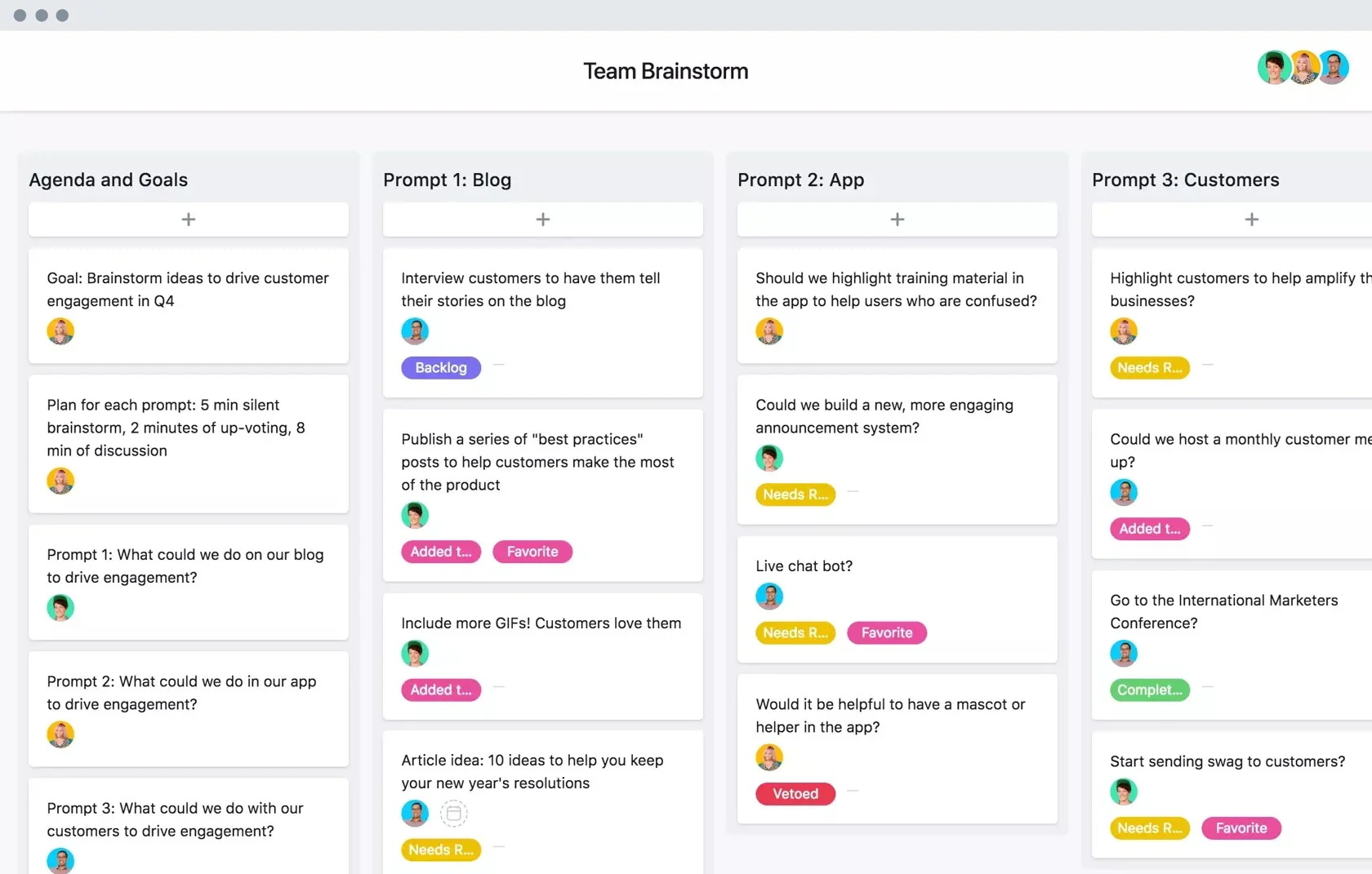
A clean screenshot of a "Team Brainstorm" board, columns of color-coded tasks. About 615 days live.
Asana advertises a finished use case — a brainstorming board you could copy today — rather than the platform in the abstract. Leading with the outcome lets the buyer picture their own work already organized inside it.
Clone it: the Asana board layout is in the library — swap in a screenshot of your own product solving a job.
13. Asana — A second job, a second template
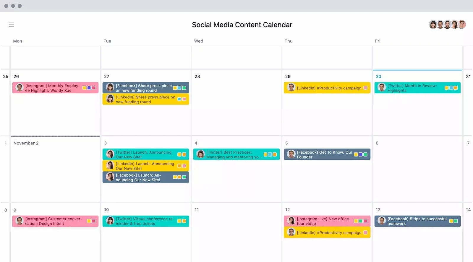
Same playbook, different job: a "Social Media Content Calendar" laid out across a week, tagged by platform. Roughly 557 days running.
Running one proven layout against multiple use cases is how SaaS scales creative without starting over. The format is fixed; only the template inside it changes, which is exactly the kind of swap that takes minutes instead of a new design brief.
14. Framer — Outcome first, then the proof grid
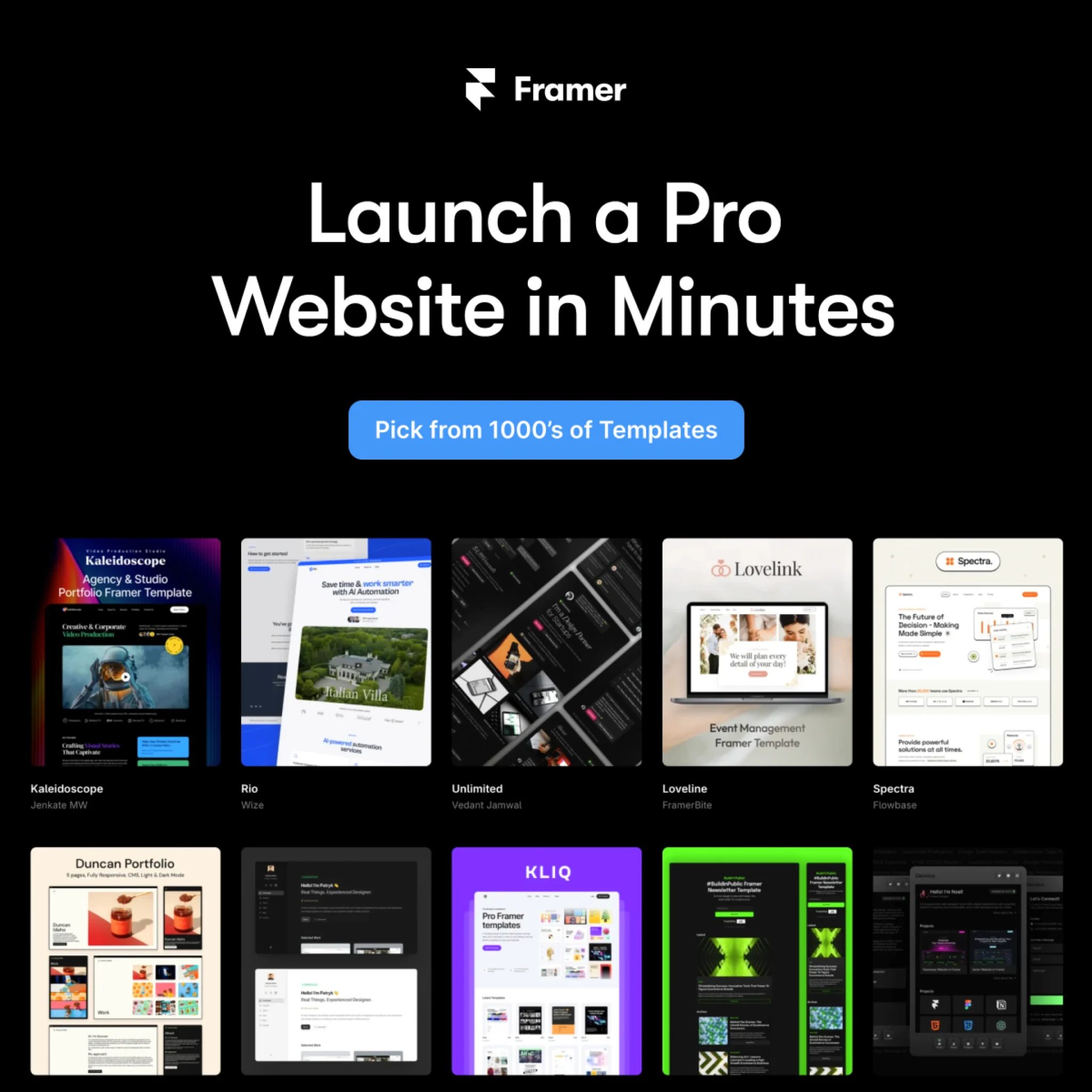
"Launch a Pro Website in Minutes," CTA "Pick from 1000's of Templates," over a grid of polished site thumbnails. About 481 days live.
A headline sells speed; the template grid proves it. Showing real, attractive output answers the unspoken question behind every website-builder ad — "but will mine look good?" — before it's asked.
15. Framer — Name the competitor on purpose
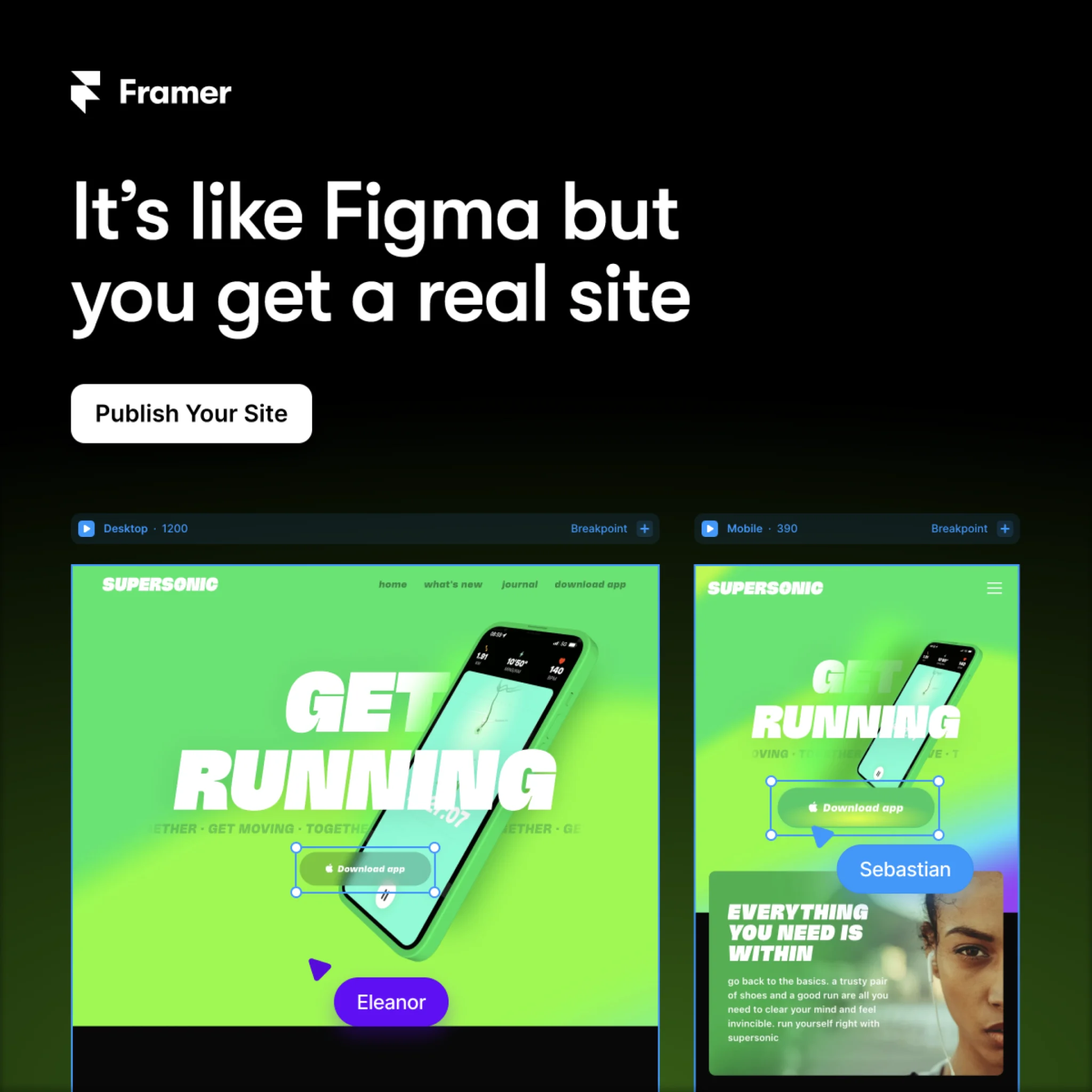
"It's like Figma but you get a real site." CTA: "Publish Your Site." Roughly 479 days running.
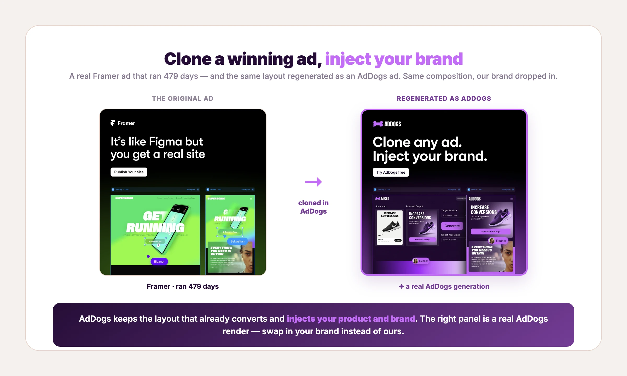
Most SaaS brands tiptoe around rivals. Framer borrows Figma's familiarity to explain itself in one sentence, then claims the upgrade ("a real site"). Comparison framing works because it meets the buyer where their mental model already is. AdDogs is built on the same instinct — start from the thing people already recognize, then make it yours.
Clone it: the Framer comparison layout is in the library — name your reference, show your edge.
16. Framer — Meet the buyer inside their current tool
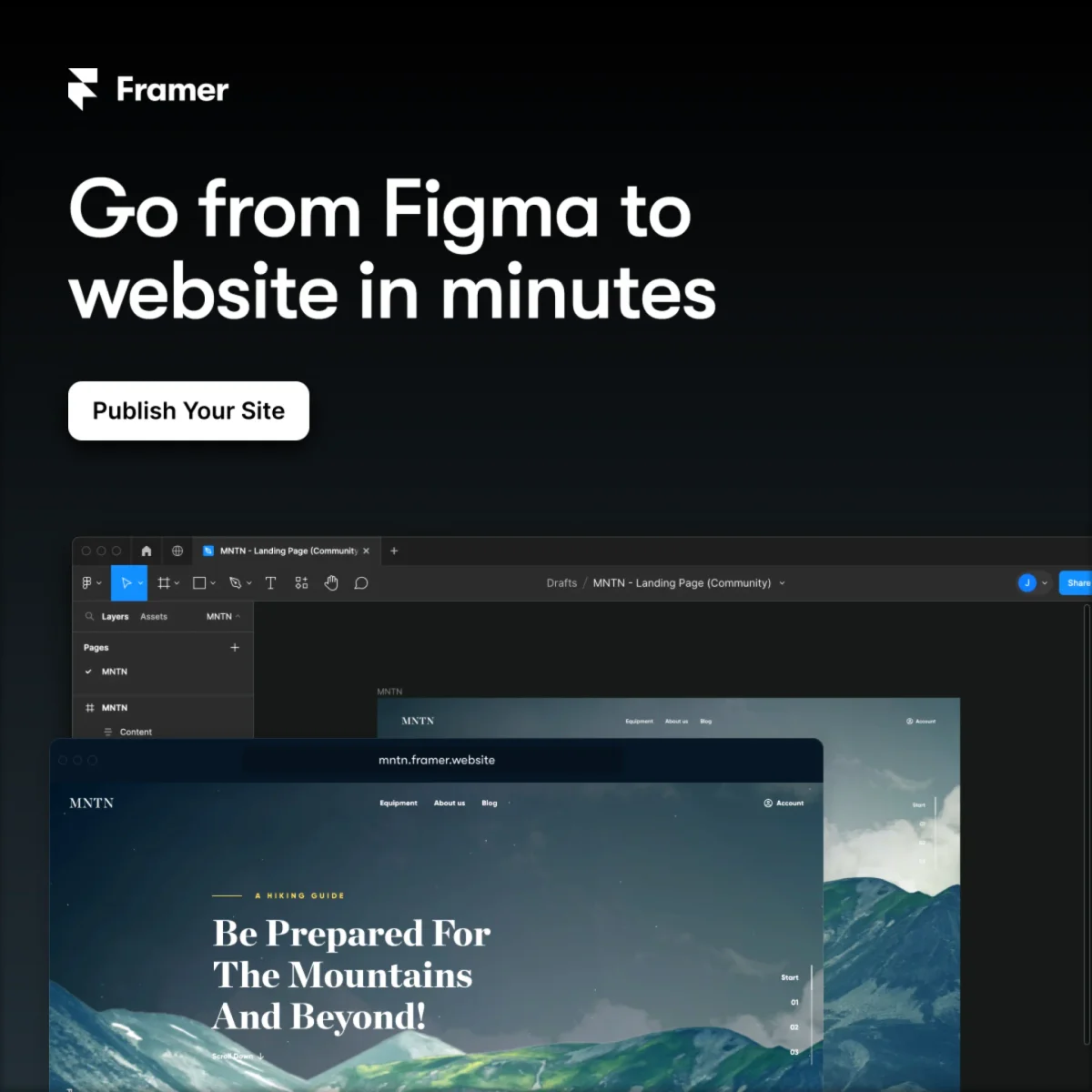
"Go from Figma to website in minutes," a white "Publish Your Site" button, and the Framer editor rendering a hiking site at a real URL. About 440 days live.
Where ad #15 borrows Figma as a comparison, this one names the migration itself: you're in Figma today, you'll be live in minutes. Speaking to the workflow the buyer is midway through beats describing the destination — the ad meets them at the exact step they're stuck on.
Clone it: the Framer Figma-to-website layout is in the library.
17. Coursera — Borrow authority, show the stars

"Generative AI with Large Language Models from DeepLearning.AI," a 4.9-star rating with "250 Ratings," and "Become an expert in generative AI." Around 366 days live.
Two proof signals stack here: a co-brand the audience trusts (DeepLearning.AI) and visible review stars. For a considered purchase like a course, third-party credibility inside the ad lowers the perceived risk before anyone reaches the landing page.
18. Coursera × Penn — The same proof stack, refreshed for 2026

"AI for Business Specialization from the University of Pennsylvania," a 4.7-star rating with 243 ratings, and "Become an expert in machine learning in 1 month." Around 366 days in market.
Set this next to ad #17 and the skeleton is identical: institutional co-brand, visible stars, one outcome line with a time-box. Only the topic moved with the market. When the same layout keeps winning across years and subjects, the template is earning its keep — borrow it.
Clone it: the Coursera co-brand layout is in the library — borrow the structure, bring your own proof.
19. Webflow — A pain stat that earns the click
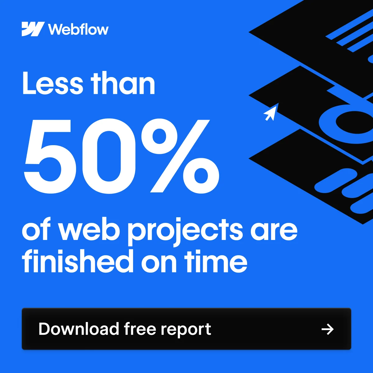
"Less than 50% of web projects are finished on time," then a black "Download free report" button. Roughly 332 days running.
It's a lead magnet, not a hard sell. The stat names a pain the audience feels, and the ask is a free report rather than a demo — a low-commitment trade that fills the top of the funnel with people who've already admitted they have the problem.
Clone it: the Webflow stat layout is in the library — swap in your own stat and gated offer.
20. Webflow — The second asset proves the engine
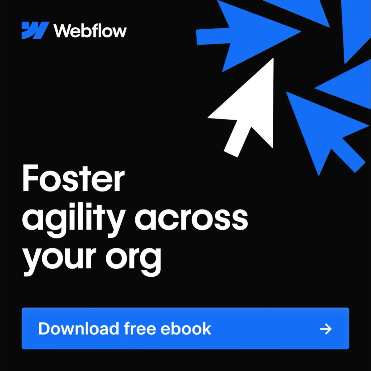
"Foster agility across your org," oversized cursor arrows, and a blue "Download free ebook" button. Roughly 332 days running — the same duration as the pain-stat ad above it.
One gated report could be a fluke. Two is a lead-gen engine. Where ad #19 targets the practitioner with a stat, this one aims a rung higher — the org-level buyer — with the same mechanics: name a pain, gate a PDF, collect the lead. Different role, same machine.
21. Robinhood — Outcome plus honest fine print
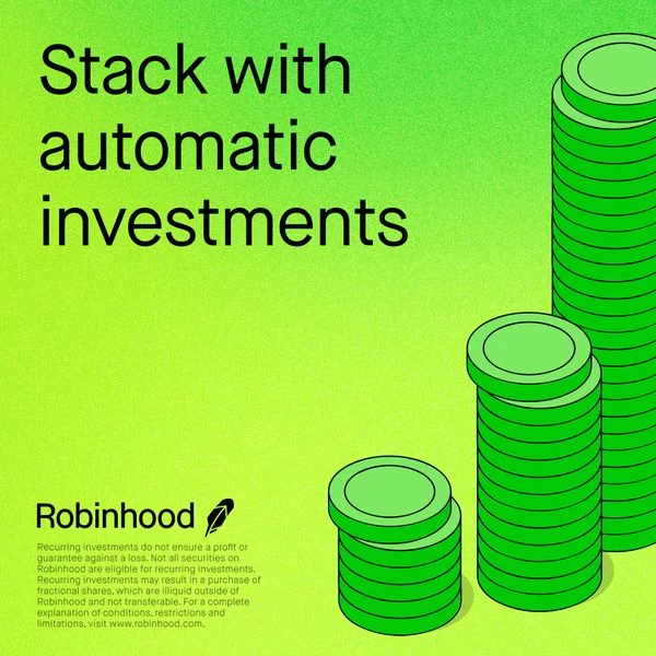
"Stack with automatic investments" in heavy black type, ascending coin stacks, and a block of compliance disclaimer at the bottom. About 314 days live.
Fintech ads carry regulatory weight, and Robinhood designs the disclaimer in rather than hiding it. The lesson for any SaaS in a regulated space: the legal copy is part of the layout, so plan for it instead of bolting it on.
22. Coinbase — Lead with the incentive
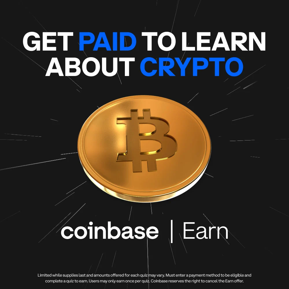
"Get paid to learn about crypto," a glinting gold Bitcoin, "coinbase | Earn." Roughly 166 days running.
Here the offer is the hook. Instead of asking newcomers to risk money, Coinbase Earn flips the value exchange — you get paid to onboard — which neutralizes the biggest objection (fear) for a first-time audience.
23. Chegg — A benefit headline over a real moment

A candid photo of a student on her phone, then "Homework help—that actually helps" and "Learn with Chegg." A newer library pull, so no day count yet — the same goes for the entries below that show no number.
That "that actually helps" qualifier does quiet work: it acknowledges that students have been burned by tools that don't, and positions Chegg against that skepticism. A relatable photo plus one honest benefit beats a feature rundown for a young, ad-weary audience.
24. Grammarly — Let the ad demo the product
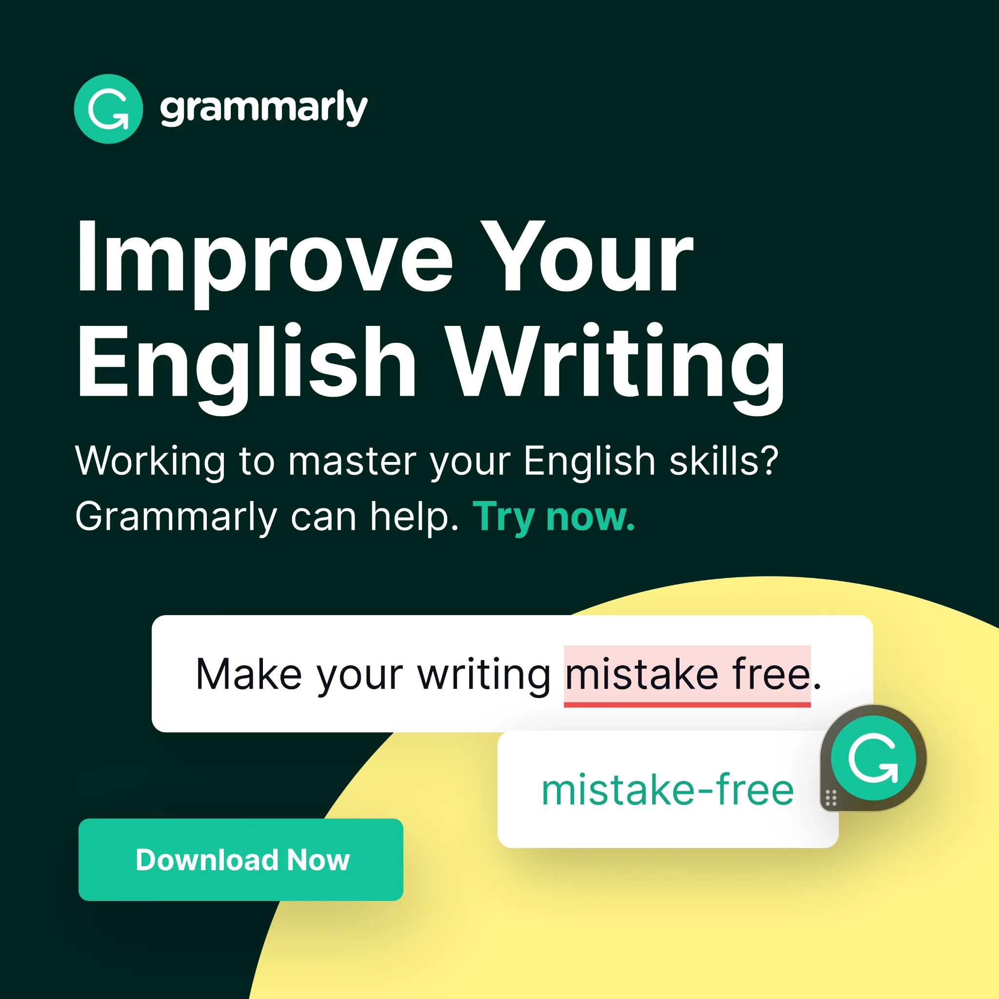
"Improve Your English Writing." Below it, the product itself: a sentence with "mistake free" underlined in red, corrected to "mistake-free." CTA: "Download Now."
Notice the ad is a live demo. Showing the exact before-and-after of the product working is more persuasive than any adjective, because it proves the value in the creative rather than promising it. Demo-first is the safest bet when the product's benefit is visual.
25. Figma — Target one audience, ask for a demo
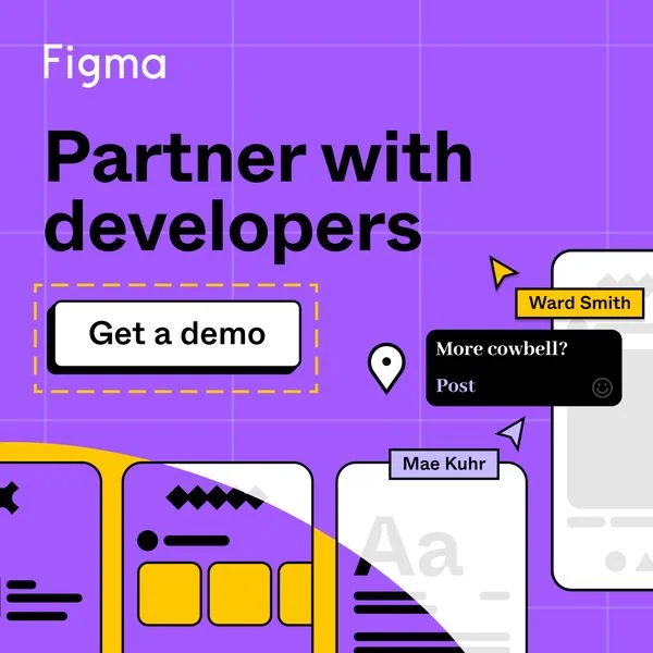
"Partner with developers," a dashed "Get a demo" button, and design-handoff mockups in Figma's purple. The copy speaks to one job — design-to-dev collaboration — not to Figma in general.
Narrowing the message to a single audience and a single workflow makes the ad feel written for the reader. The "Get a demo" ask suits a higher-consideration, team-level purchase where a free trial isn't the natural next step.
26. monday.com — Advertise the webinar, not the software
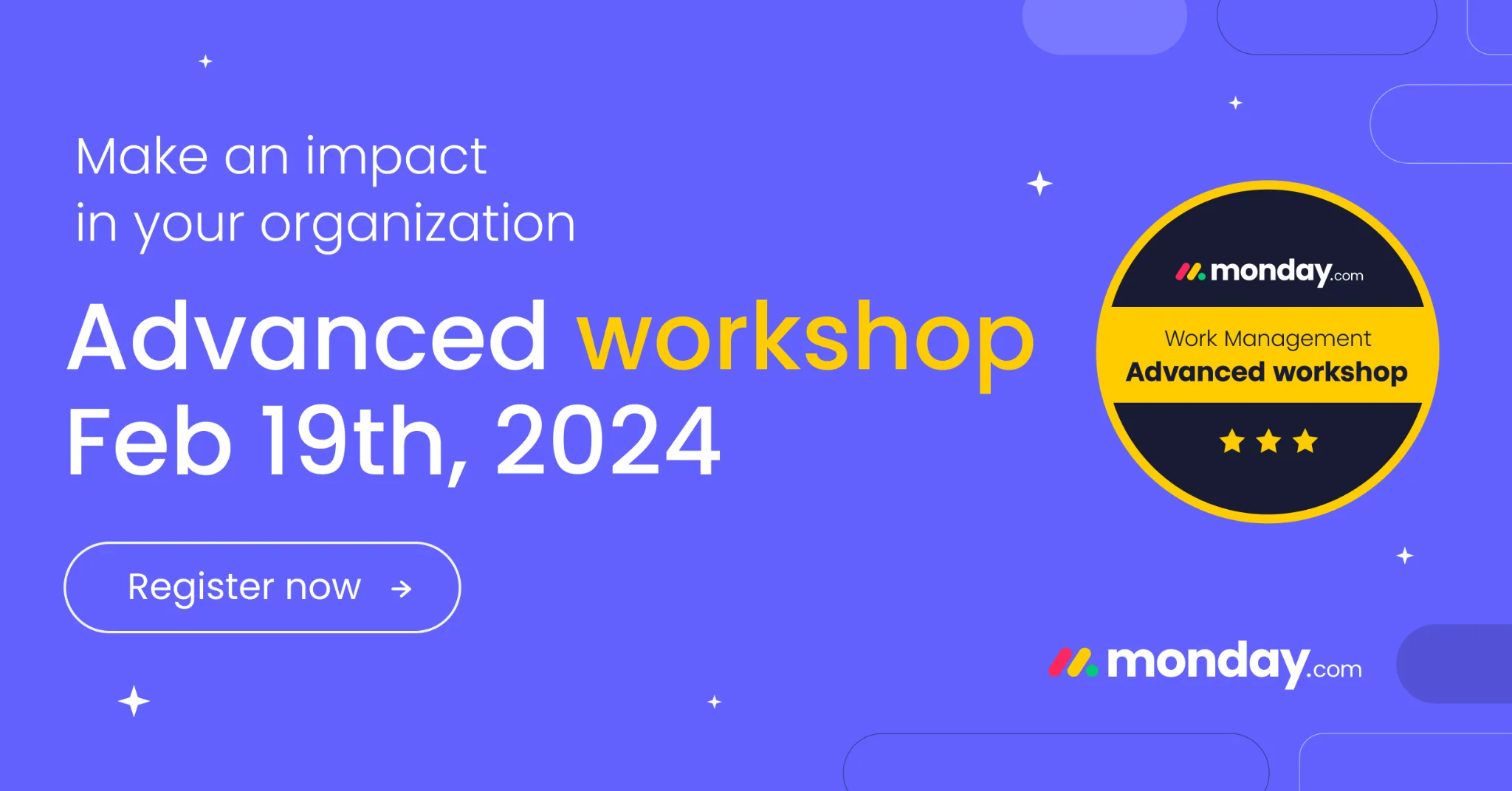
"Make an impact in your organization," then "Advanced workshop," a date, a certification badge, and "Register now."
Event registration is a softer entry point than a sales page. By promoting a workshop, monday.com captures intent from people not ready to buy but willing to learn — and the certification badge adds a status incentive to sign up.
27. Squarespace — One stat, one elegant frame
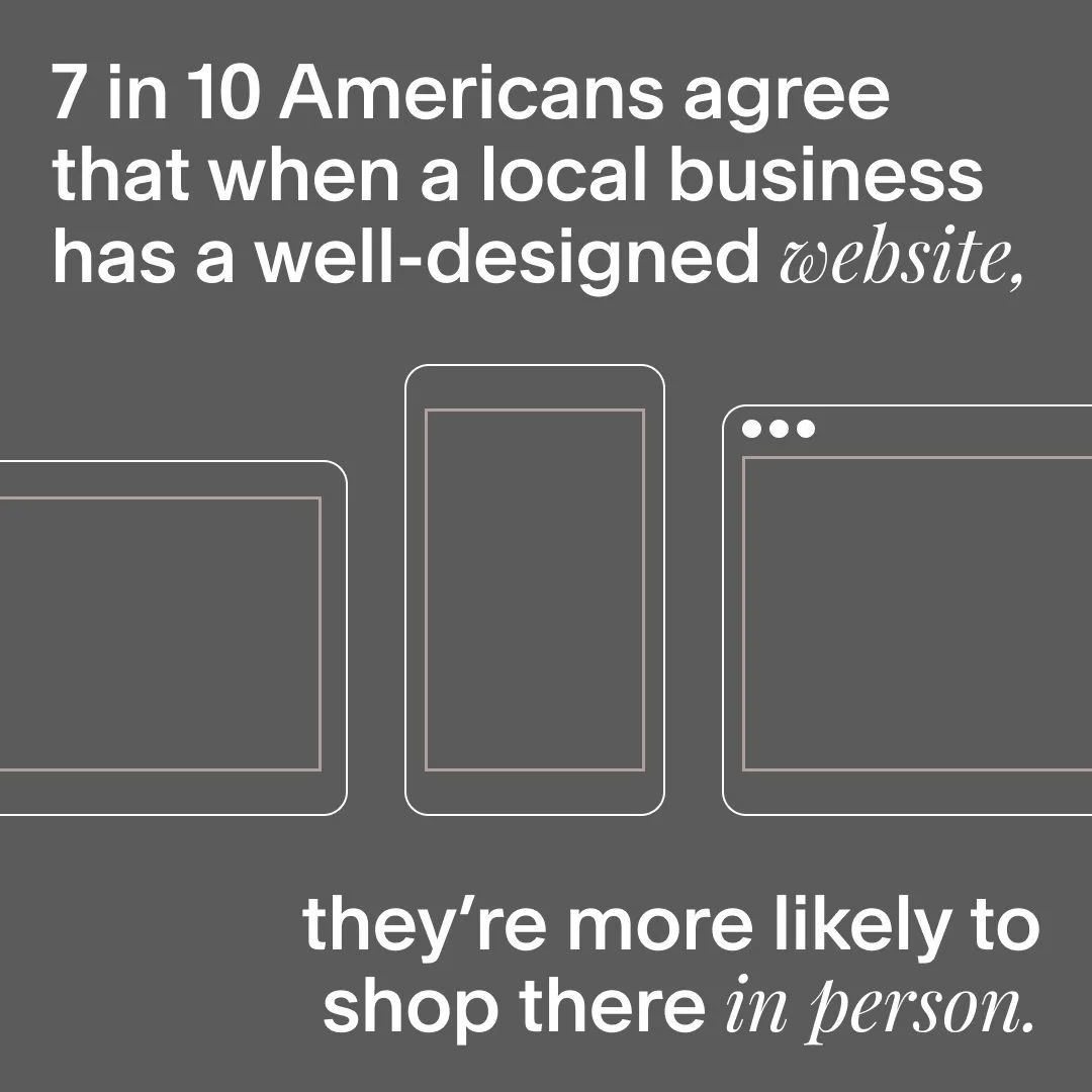
"7 in 10 Americans agree that when a local business has a well-designed website, they're more likely to shop there in person." Minimal device outlines, lots of negative space.
That stat reframes a website from a nice-to-have into a revenue driver, aimed squarely at small-business owners. Restrained typography and white space signal the design quality Squarespace is selling — the ad practices what it pitches.
The variant test you can see in the wild
Big SaaS doesn't pick a headline — it tests three. Shopify Plus's ad account is the clearest public example: the first two entries below are not separate campaigns but two live experiments, running exactly the kind of creative testing the platforms now reward. If you're wondering how many ad creatives to test, this is what the answer looks like in production.
28. Shopify Plus — Three headlines, one ebook
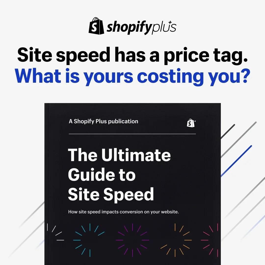
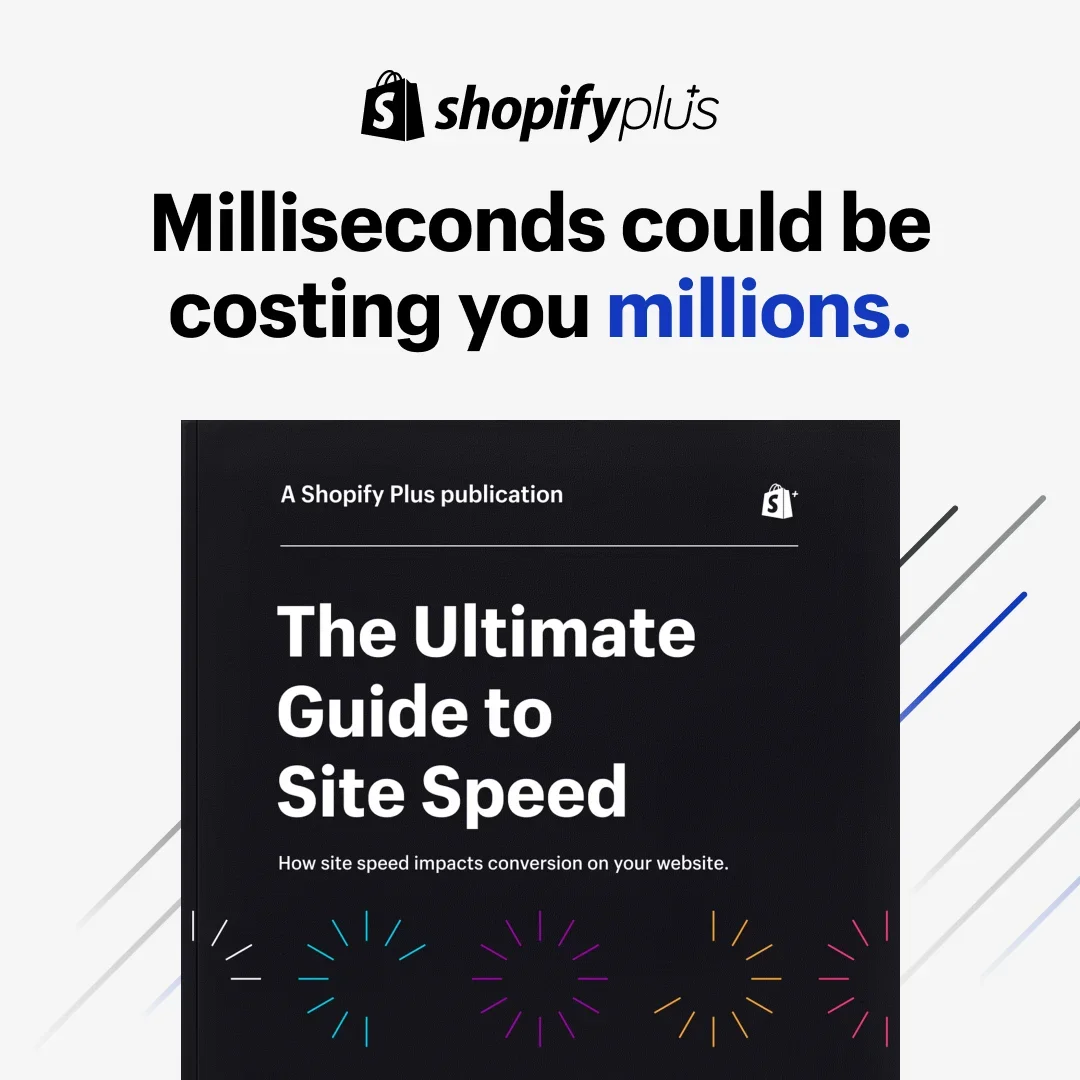
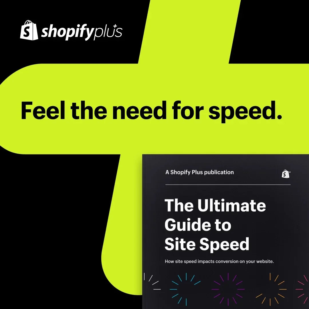
The same "Ultimate Guide to Site Speed" ebook, three live headlines: "Site speed has a price tag. What is yours costing you?" — "Milliseconds could be costing you millions." — "Feel the need for speed."
One hook prices the pain, one escalates it to millions, one goes pure velocity. Shopify never touches the creative underneath, which is the discipline: the headline is the cheapest variable to test and the most powerful one to get right, so Shopify isolates it and lets the auction pick the winner. Public library data shows the test, not the verdict — the winning headline stays in Shopify's dashboard. What transfers is the discipline.
Clone it: the Shopify site-speed layout is in the library — write three hooks for one asset and test them honestly.
29. Shopify Plus — Same copy, two moods
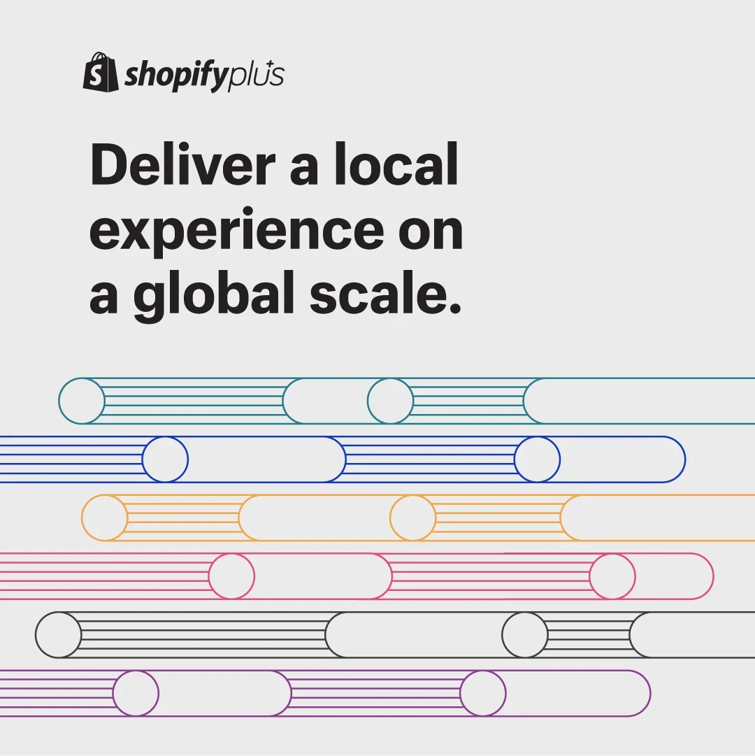
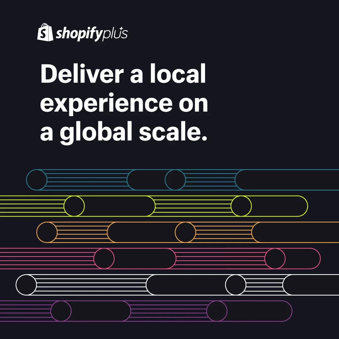
"Deliver a local experience on a global scale" — identical headline, identical abstract line-art, one version on light gray and one on near-black.
It's a single-variable test with everything else frozen. Background alone changes how premium, how technical, and how loud an ad feels in the feed, and it costs nothing to produce the second version. Your cheapest-ever test is the one where only the mood changes.
Clone it: the Shopify global-scale layout is in the library.
30. Shopify Plus — Gate the playbook, not the product
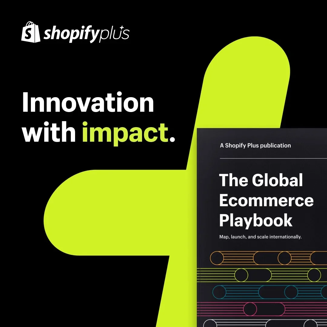
"Innovation with impact" next to the "Global Ecommerce Playbook" cover, set on Shopify Plus's lime brand shape.
Same lead-magnet logic as Webflow's ads above, executed at enterprise polish: the gated asset is the hero, the brand shape makes it unmistakably Shopify from across the room, and the ask stays a download. For high annual-contract-value (ACV) SaaS, the playbook is the product's opening argument.
Clone it: the Shopify playbook layout is in the library — put your gated asset on your brand shape.
31. Shopify — The dashboard is the dream
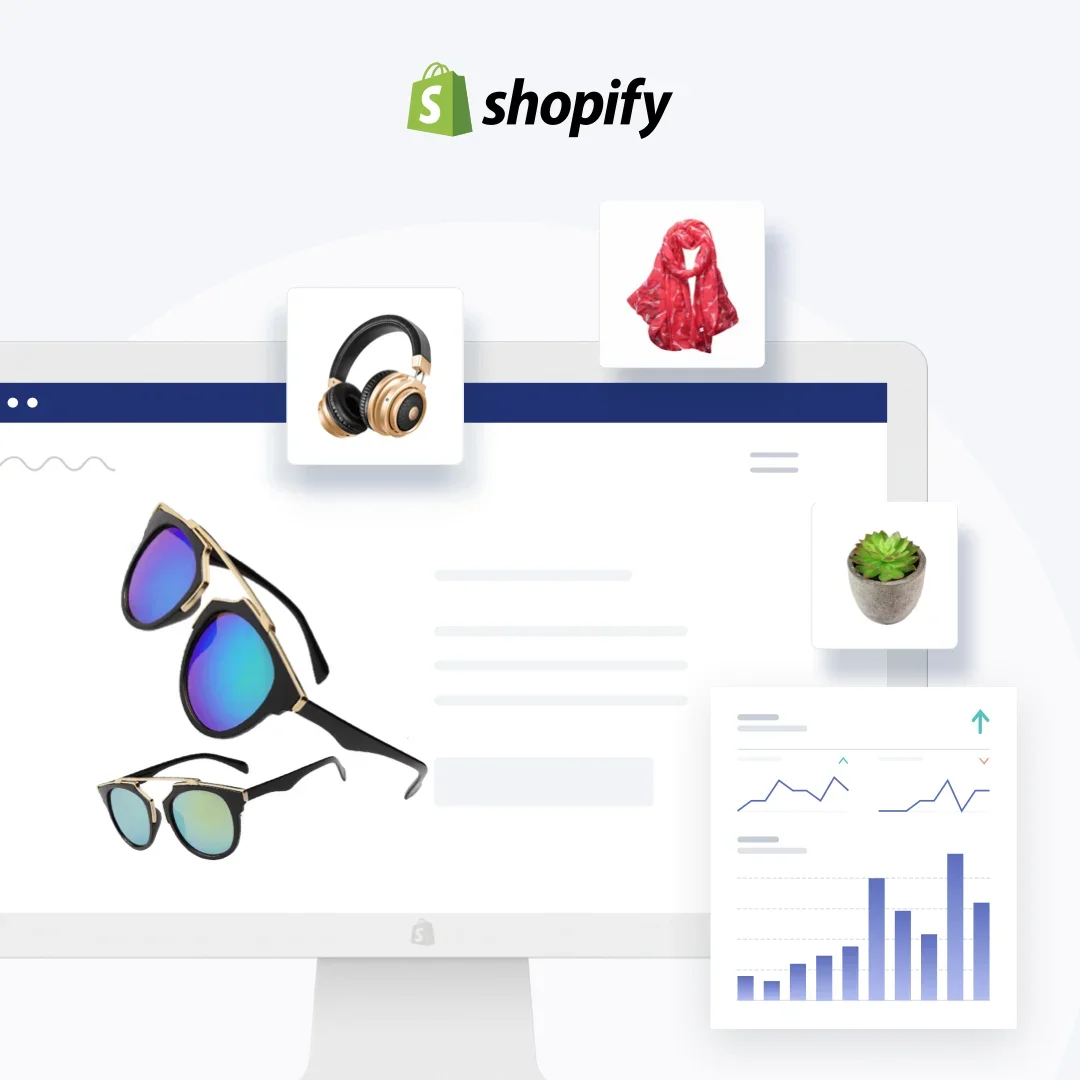
A composite of the merchant dashboard: product cards (sunglasses, headphones, a scarf), analytics trending up, everything floating around a clean storefront frame.
Aimed at the aspiring merchant, the ad shows the end state — a stocked store with sales moving — rather than any feature. For every e-commerce reader of this list: this layout, with your products in the cards, is the most directly cloneable frame in the roundup. Find it and its siblings in the SaaS ad examples library.
What the best Meta SaaS ads share
Strip these 31 down and the same skeleton repeats: a single legible claim, the product or its output shown in-frame, one proof element, one low-friction CTA. The best SaaS ads here — DataCamp, Blinkist, ClickUp, Zapier, the longest runners of the set — are also the simplest.
Where to start, by what you sell: a self-serve tool clones ClickUp's one-liner (#9) or Zapier's toggle demo (#10); a lead-gen B2B product starts from Webflow's pain-stat magnet (#19); an e-commerce product goes straight to Shopify's dashboard frame (#31); a course or content subscription copies DataCamp's one-promise restraint (#1). Longevity rewards clarity, not cleverness. And remember the 2%: every workhorse here outlived dozens of killed variations, which is the real case for making new creative cheap to test — Shopify's live headline trio above is that discipline in production. If you want more proven layouts to start from, the best ad libraries are where to browse them.
Create your own facebook product ads
Create your ad
Where to run SaaS ads, and what each platform costs
Every ad above ran on Meta, because that's where SaaS tests creative cheaply. But the platform you pick should match the funnel stage — and the cost gap between them is large enough to change your whole plan. Here's what SaaS advertising actually costs on the three platforms that matter, and what each one is good for.
Meta (Facebook and Instagram): test creative cheaply
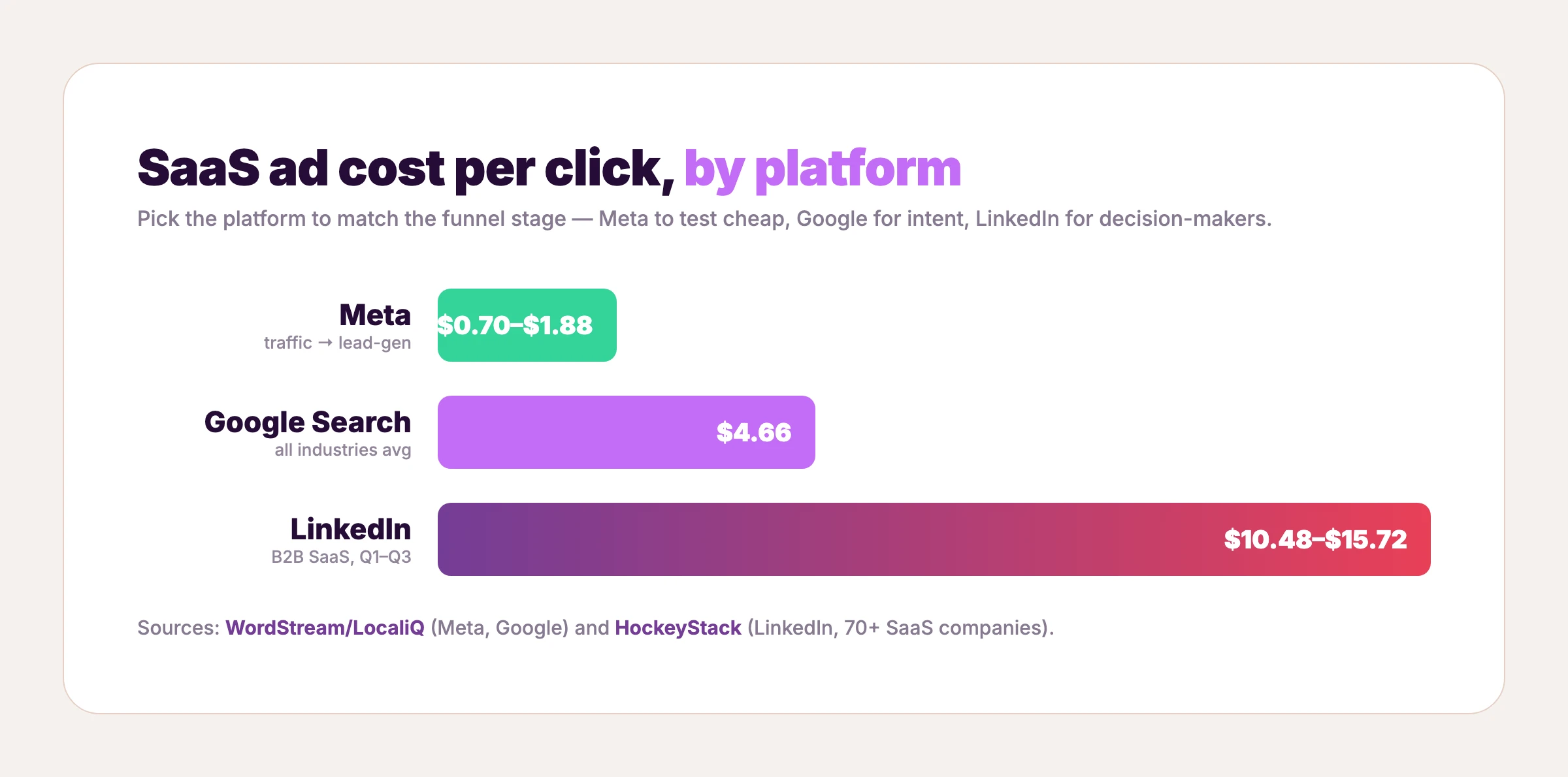
Meta is the cheapest place to fail fast. The average cost per click is $0.70 for traffic and $1.88 for lead-gen campaigns, with the technology vertical around $1.27 (WordStream). That low entry cost is why Facebook ads for SaaS are the default testing ground: you can run 20 variations of a static ad, kill the 18 that flop, and scale the two that work without burning the budget. Every one of the 31 examples above is a Meta ad, and the longest-running ones prove the model — cheap to test, durable once they land.
Google Search: catch demand at the moment of intent
Google costs more because it captures people already looking. The average search click runs $4.66 with a 7.52% conversion rate across industries (WordStream); non-brand SaaS clicks can run $8.50 to $14 by one agency's data (GrowthSpree, treat as directional). Google ads for SaaS live at the bottom of the funnel — a search ad's whole job is to match the outcome someone just typed, so the same "lead with the result, not the feature" principle from the ads above applies, compressed into a few lines of text.
LinkedIn: reach the decision-maker, expensively
LinkedIn is the opposite of Meta — patient and pricey. B2B SaaS ads run a median cost per click of $10.48 to $15.72 (HockeyStack, across 70+ SaaS companies and $28M in spend), at click-through rates under 1% and a CPM around $31. A Cognism study of 761 B2B ads found only about a quarter of creatives convert at all. So LinkedIn ads for SaaS rarely win on the click — their job is recall and qualification among buyers a higher-ACV product can afford to reach. Video is the format growing fastest here: LinkedIn's video inventory rose 74% year over year (NAV43). No LinkedIn creative made the 31 above, and that's deliberate — our bar is a verifiable image with provable run time, which today only Meta's public library clears.
What this means for your budget
A median SaaS company now takes 18 months to earn back its customer acquisition cost, up from 14 (Benchmarkit) — so the cost per click matters less than the cost per winning creative. Napkin math for a small account: giving each of 20 static variants roughly 30 clicks of signal at the tech vertical's $1.27 CPC runs about $760 — a real test cycle inside a $1,000 line item, provided the creative itself costs nearly nothing to produce. The common sequence: test creative cheaply on Meta, send your winners to Google to catch intent, and add LinkedIn only when your deal size justifies a $15 click. Across all three, the lever is the same one the 2% rule points to — a better ad beats a bigger budget, and the fastest way to a better ad is to start from one that already worked.
How to make a SaaS ad like these without a designer
Across all 31, the pattern is the same: the layout is the hard part, and someone already solved it. ClickUp figured out the bold-headline-plus-UI frame. Framer nailed the comparison. Webflow proved the pain-stat lead magnet. You don't need to reinvent any of that — you need your product inside the layout that already works.
That's what AdDogs does. Pick any ad that fits your offer — many of the ones above are already in the SaaS ad examples library, ready to clone, alongside the full 14,000+ ad examples — upload your product, and the AI rebuilds the ad with your product in place, preserving the layout, style, and composition. It extracts your brand colors and logo automatically and applies them, so the output looks like you and not like the reference. The whole thing finishes in seconds.
If you'd rather weigh the broader field first, the best AI ad generators covers the generate-from-scratch tools too — but the clone-a-winner approach is what AdDogs is built for. Paid plans run $12, $33, and $63 a month on Basic, Pro, and Ultimate — roughly $0.40, $0.33, and $0.30 per ad. One credit produces one finished ad in the dimension you pick. Pro and Ultimate unlock all 14 aspect-ratio options, so the Meta square you cloned today can become a Portrait (9:16) for TikTok or a wide banner for Google on the next render. Find a SaaS ad that already converts, make it yours, and ship a platform's worth of variations from a single layout — see pricing for the full breakdown.
FAQ
What are SaaS ads?
SaaS ads are paid placements that promote subscription software — from project-management tools to learning platforms — on channels like Meta, Google Search, and LinkedIn. Because the product is intangible, the strongest ones show the interface or its output doing the job. The 31 examples above are real SaaS ads that stayed live for between 166 and 2,251 days.
What makes a good SaaS ad?
A good SaaS ad makes an invisible product legible fast: it shows the product or its output, states one clear claim instead of a feature list, names a specific pain, and asks for one low-friction action. The best SaaS ads in this roundup — DataCamp's ran over six years — are also the simplest, which suggests clarity outlasts cleverness.
Which platform is best for SaaS advertising?
It depends on the motion. Meta is cheapest for testing creative fast (around $0.70 to $1.88 per click) and suits self-serve products. Google Search ($4.66 average CPC) catches high-intent demand. LinkedIn is the most expensive ($10 to $16 CPC for SaaS) but reaches decision-makers for higher-ticket B2B. Most SaaS companies run all three, matched to funnel stage — the platform cost breakdown above has the full numbers.
How much do SaaS companies spend on ads?
B2B SaaS sits inside a B2B digital ad market projected to reach roughly $48 billion globally by 2026 (eMarketer), growing about 13% year over year. At the company level, paid acquisition is significant enough that the median SaaS business now takes around 18 months to earn back its customer acquisition cost (Benchmarkit), which is why creative efficiency matters so much.
Should SaaS ads use video or static images?
Both, by job. Static ads are faster and cheaper to test and excel at a single legible claim — every proven example here is static. SaaS video ads earn their keep when the product needs explaining or demonstrating: explainers, screen-recorded demos, and customer-story cuts. A common starting split is to test broadly with static, then put video behind the concepts that win. See static vs video ads for the trade-offs.
How do you write SaaS ad copy that converts?
Lead with the outcome or the pain, not the feature. "One app to replace them all" and "less than 50% of web projects are finished on time" both work because they name something the reader already feels. Keep one claim per ad, put a proof element in the creative itself (a stat, stars, a logo, a co-brand), and close with a single low-commitment ask.
How many ad creatives should a SaaS company test?
Platform guidance clusters around three to six static variants per ad set, refreshed as winners fatigue — Shopify Plus's live site-speed campaign runs three headline variants on a single asset, which is the pattern in production. Full math on volume, win rates, and refresh cadence is in how many ad creatives to test.
Where's the best place to find SaaS ad inspiration?
Ad libraries that show ads with real run-time data are the most useful, because longevity signals what's actually converting. Browse the best ad libraries for the tools, or the AdDogs library to find a layout and clone it with your own product. The brands above — ClickUp, Zapier, Framer, Webflow, and the rest — are a strong starting shortlist.