SaaS and Tech Ad Examples

Browse 1,636 software and SaaS ad examples sourced from high-performing campaigns. Clone any design, swap in your product, and get a finished ad in seconds.

Updated August 2026

SaaS ads have two jobs and one visual to do both. Jobs: show the problem, show the fix. Visual: almost always a screenshot — a zoomed feature, a dashboard hero, a red-squiggle Grammarly moment, a Linear issue view. Grammarly, HubSpot, Notion, Linear, and Airtable all run variants of this because screenshot-first creative compresses the value prop faster than lifestyle framing. Three moves carry the category: feature zoom inside a phone or browser mockup, before-after of a workflow (typos to clean copy, messy spreadsheet to structured base), and brand-color discipline tight enough that the palette alone identifies the company.

Palette commitment is the SaaS visual signature most categories never match. Grammarly green. HubSpot orange. Notion black-on-cream. Linear deep purple. Airtable orange-coral. Webflow blue-purple. Platform mix follows ICP: LinkedIn Sponsored Content (1.91:1) dominates B2B and enterprise, Meta carries prosumer SaaS at 1:1 and 4:5 portrait, Google Search picks up bottom-funnel intent. Copy stays short and problem-led: "Stop sending emails with typos," "Close faster."

Browse SaaS and tech ad examples pulled from real campaigns — dashboard heroes, feature callouts, before-after workflow screenshots, customer-logo walls, and founder LinkedIn posts. Pick a template, upload your product screenshot, and AdDogs applies your palette across three formats.


Oura Ring — Icy Product Hero Shot
Oura
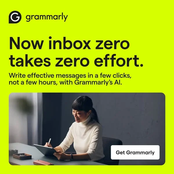
Grammarly Productivity — UI Mockup with Headline
Grammarly
Grammarly — Bold Split Screen with Lifestyle
Grammarly
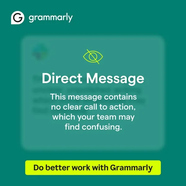
Grammarly — Message UI Mockup with CTA
Grammarly
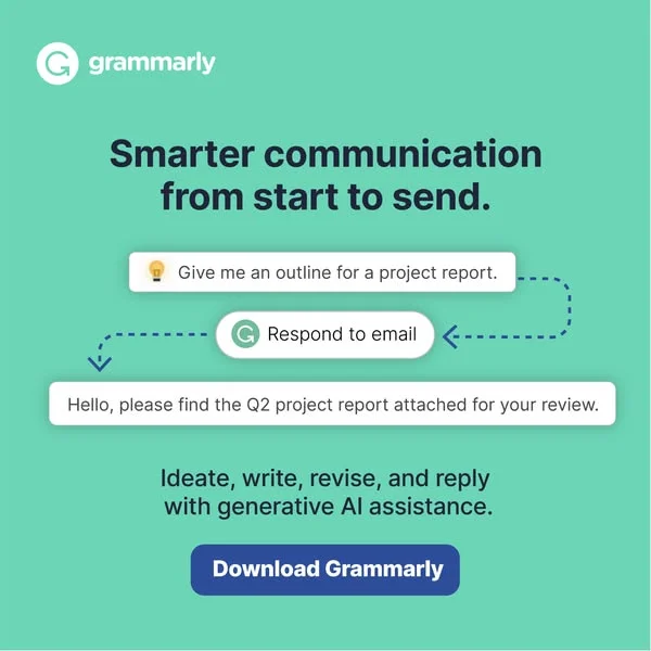
Grammarly — AI Workflow Demonstration UI
Grammarly
Gusto — Social Proof with 3D Characters
Gusto
HubSpot AI Ebook — Split Screen UI Mockup
HubSpot
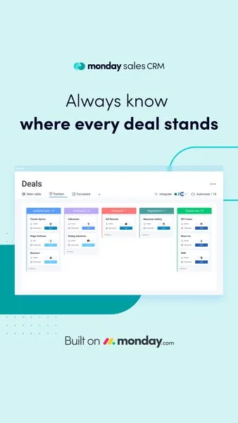
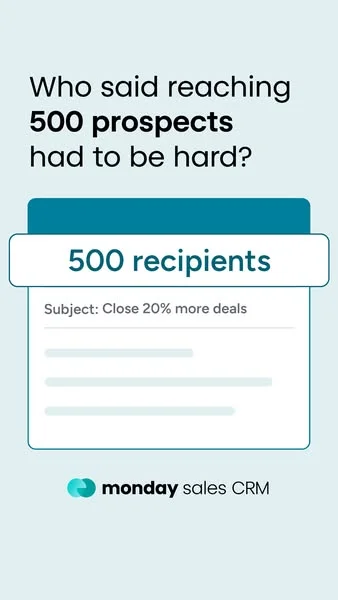
Monday.com Sales CRM — Clean UI Mockup
monday.com
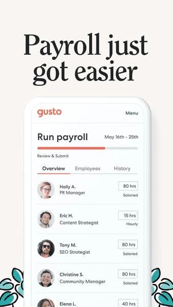
Gusto Payroll — Clean UI Mockup
Gusto
Monday.com Sales CRM — Problem/Solution UI Mockup
monday.com
Deep Learning in Python — Abstract Network Layout. Brand: Python. This ad effectively uses a dark, abstract network background to visually represent complex data and technology, immediately signaling its topic: Deep Learning. The layout strategically places the prominent white headline "Deep Learning in Python" on a dark gradient at the bottom-left, ensuring high contrast and readability against the busy background. The Python logo is positioned bottom-right, offering instant brand recognition for the target audience. The dominant blue color palette evokes trust, intelligence, and innovation, aligning perfectly with a tech-focused educational offering. Compositionally, the dynamic lines and subtle concentric circles draw the eye into the depth of the image, while the clear text hierarchy grounds the message. This design is optimized for platforms like Google or LinkedIn, where professionals seek clear, informative content, leveraging strong visual cues to stop the scroll and convey expertise.. Headline: Deep Learning in Python. Why this ad works: Dynamic blue network conveys advanced technology — The intricate blue lines and glowing nodes effectively visualize data networks and AI concepts. This abstract representation immediately communicates the complex, cutting-edge nature of deep learning, attracting an audience interested in advanced technological subjects and setting a sophisticated tone for the content. High contrast text ensures immediate readability — The stark white "Deep Learning in Python" text against the dark, semi-transparent gradient at the bottom of the ad provides exceptional contrast. This strategic placement and color choice ensure the core message is instantly legible, even on smaller screens or when quickly scrolling through a feed, maximizing message retention. Python logo provides instant subject recognition — The universally recognized Python logo, prominently placed in the bottom-right corner, immediately identifies the programming language central to the offering. For the target audience of developers and data scientists, this visual cue instantly validates the ad's relevance and expertise, building trust and engagement without additional text.. Specs: Brand: Python, Industry: Software & Tools, Platform: Google, Format: Static, Audience: ProfessionalsDataCamp — Skill Icons & Central Headline. Brand: DataCamp. This ad effectively uses a clean, minimalist layout to communicate its core value proposition for B2B training. The dark blue gradient background provides a professional yet approachable tone, allowing the prominent white headline text and vibrant skill icons to pop. The central composition with the headline at the top and the brand logo at the bottom creates a clear visual hierarchy, guiding the viewer's eye from the problem statement to the solution provider. The horizontal row of recognizable data science tool icons immediately signals the breadth and specificity of training offered, appealing directly to professionals and decision-makers seeking tangible skill development for their teams. This design is optimized for platforms like Google Display or LinkedIn, where quick comprehension and professional relevance are key to capturing B2B attention. The low text density ensures the message is digestible at a glance, making it highly effective for driving consideration among busy professionals.. Headline: UPSKILL YOUR TEAMS IN DATA SCIENCE & ANALYTICS. Why this ad works: Clear Value Proposition & Skill Visuals — The headline "UPSKILL YOUR TEAMS IN DATA SCIENCE & ANALYTICS" directly addresses a business need. Below it, the easily recognizable icons for Python, R, SQL, Git, etc., visually reinforce the specific skills taught, immediately communicating the program's scope and relevance to target professionals and decision-makers. Professional & Trustworthy Color Palette — The deep blue gradient background combined with crisp white text and clean, distinct icons creates a professional and trustworthy aesthetic. This color scheme resonates with corporate environments, signaling reliability and expertise, which is crucial for B2B educational services like DataCamp, fostering confidence in the offering. Strong Visual Hierarchy & Brand Reinforcement — The ad employs a clear top-to-bottom hierarchy: problem/solution statement, specific offerings, and then brand identity. Placing the DataCamp logo prominently at the bottom, alongside "FOR BUSINESS," ensures strong brand recall and positions the offering clearly for its intended B2B audience, enhancing memorability.. Specs: Brand: DataCamp, Industry: Software & Tools, Platform: Google, Format: Static, Audience: ProfessionalsDataCamp — Skill Icons & Central Headline. Brand: DataCamp. This ad effectively uses a minimalist layout to convey a clear value proposition. The central, bold headline immediately addresses the target audience's need: "UPSKILL YOUR TEAMS IN DATA SCIENCE & ANALYTICS." Below, a horizontal array of six distinct, vibrant icons visually represents the core skills offered (Python, R, SQL, Git, Terminal, Spreadsheets). This composition technique breaks down complex information into easily digestible visual cues. The deep blue background evokes professionalism and trust, while the contrasting white text and colorful icons ensure high readability and visual engagement, crucial for platforms like LinkedIn or Google Display. The symmetrical balance and ample negative space guide the eye directly to the key message and brand logo, optimizing for quick comprehension and brand recall.. Headline: UPSKILL YOUR TEAMS IN DATA SCIENCE & ANALYTICS. Why this ad works: Clear, direct value proposition headline — The headline "UPSKILL YOUR TEAMS IN DATA SCIENCE & ANALYTICS" is direct and benefit-oriented. It immediately communicates the core offering and target audience (teams), making it highly effective for B2B lead generation by clearly stating the problem it solves for potential clients. Visual representation of key skills — The row of six distinct icons (Python, R, SQL, etc.) provides an instant visual summary of the breadth of skills covered. This technique quickly conveys expertise and relevance to data professionals, acting as a powerful visual hook that complements the headline's message. Professional and trustworthy color palette — The deep blue background combined with white text and the brand's blue-and-white logo creates a professional and trustworthy aesthetic. This color psychology is ideal for a B2B offering, signaling reliability and expertise, which are critical factors for businesses investing in employee training.. Specs: Brand: DataCamp, Industry: Software & Tools, Platform: Google, Format: Static, Audience: ProfessionalsDataCamp High-authority Vertical Layout Using. Brand: DataCamp. A high-authority vertical layout using a logo cloud to establish credibility. It serves as a perfect template for service providers highlighting tools or partnerships.. Specs: Brand: DataCamp, Industry: Software & Tools, Platform: Facebook, Format: Static, Audience: ProfessionalsStudents Learning Together — Collaborative Lifestyle Shot. This lifestyle image effectively captures a collaborative learning environment, leveraging a naturalistic layout to foster relatability. The composition places the main subject slightly off-center, her thoughtful gaze creating an implied line that guides the viewer's eye, while a shallow depth of field keeps her prominent amidst the group. Muted, authentic color tones of whites, blues, and browns evoke a sense of calm focus and genuine interaction, avoiding a staged feel. Optimized for platforms like Instagram or Facebook, this visual resonates with audiences seeking authentic content, blending seamlessly into organic feeds. The absence of explicit text allows for flexible ad copy integration, ensuring the image itself conveys the core message of engagement and learning, making it versatile for various educational or productivity-focused campaigns.. Why this ad works: Relatable student environment builds connection — The image portrays a common, authentic student setting with individuals engaged in learning. This relatability allows the target audience to immediately connect with the scene, fostering a sense of understanding and belonging. Such genuine portrayal enhances trust and makes any associated message more impactful. Thoughtful gaze implies engagement and focus — The main subject's pensive expression and upward gaze suggest deep thought or active listening. This subtle visual cue communicates engagement and intellectual curiosity, positioning the activity positively. It subtly implies that the environment or tool being advertised encourages meaningful learning and concentration. Natural lighting and muted palette enhance authenticity — The use of natural light and a soft, muted color scheme contributes significantly to the image's authentic feel. It avoids harsh, artificial tones, making the scene appear more real and less like a stock photo. This authenticity is crucial for building credibility and resonating with a discerning audience.. Specs: Industry: Education, Platform: Instagram, Format: Static, Audience: StudentsCredit Karma — Voter Registration Tweet Testimonial. Brand: Credit Karma. This ad leverages a social proof strategy by presenting a simulated tweet as a testimonial. The layout prominently features the tweet box, mimicking a native social media experience, which enhances credibility. The light blue background and minimalist illustration of a snapping hand with a star (representing a "snap" or "easy" action) create a clean, positive, and approachable vibe. The composition places the tweet centrally, ensuring immediate focus on the user's positive experience. Text hierarchy within the tweet is standard, but the overall ad's hierarchy prioritizes the testimonial. Optimized for platforms like Instagram or Facebook where user-generated content (UGC) resonates strongly, encouraging engagement and trust. The ad subtly connects Credit Karma to civic engagement, broadening its brand perception beyond just financial services.. Primary text: If you need to register to vote, check your registration or request an absentee ballot, @creditkarma is helping people out thru the app! I got an email and just followed the prompts and sent my application for my absentee ballot! Thanks @creditkarma. Why this ad works: Social proof via simulated tweet format — The ad uses a familiar tweet format to present a testimonial. This makes the message feel authentic and relatable, leveraging the trust users place in peer recommendations over direct brand claims. It's a powerful way to build credibility and encourage action, making the brand's civic involvement more believable. Civic engagement broadens brand appeal effectively — By associating with voter registration, Credit Karma taps into a timely and important social issue. This positions the brand as socially responsible and community-minded, appealing to a broader audience who value corporate citizenship beyond core financial services. It fosters a positive brand image. Minimalist design focuses on core message — The simple light blue background and isolated hand graphic ensure the tweet is the undeniable focal point. This clean composition prevents visual clutter, allowing the positive user testimonial to be absorbed quickly and effectively without distractions, enhancing message retention and clarity in a busy feed environment.. Specs: Brand: Credit Karma, Industry: Finance & Insurance, Platform: Instagram, Format: Static, Audience: GeneralTravel App — UI Mockup Discount. This ad employs a dynamic UI mockup layout, showcasing a travel-related app within a smartphone on a vibrant yellow background. The composition strategically places the phone on the left, allowing the dominant "$199" price point to command attention on the right. The bright yellow background, subtly featuring blurred furniture, creates an energetic and inviting atmosphere, while the colorful images within the phone add visual interest and context. This high-contrast design is optimized for social platforms like Instagram, where its vividness and clear value proposition (discounted lifetime subscription) can effectively stop the scroll. The text hierarchy prioritizes the large, discounted price, followed by the original price and "Lifetime Subscription," ensuring the core offer is immediately understood. The ad effectively uses visual appeal and a strong financial incentive to drive consideration.. Primary text: $199. Why this ad works: Clear Discount Offer Dominance — The large, bold "$199" immediately captures attention, clearly communicating a significant discount from the struck-through "$299 Lifetime Subscription." This direct and prominent pricing strategy effectively highlights the value proposition, creating urgency and driving immediate interest for potential subscribers looking for a deal. Vibrant, Engaging Color Palette — The ad leverages a bright yellow background, which exudes energy and positivity, effectively cutting through feed clutter. This vibrant base, combined with the rich, diverse colors of the travel images displayed on the phone, creates an inviting and adventurous aesthetic that resonates with the target audience's desire for exploration. Effective UI Mockup for Context — Presenting the product as an app within a smartphone mockup provides immediate visual context, allowing viewers to envision themselves using the service. This technique clearly demonstrates the app's content and functionality, making the abstract concept of a "Lifetime Subscription" tangible and relatable, thereby enhancing perceived utility and engagement.. Specs: Industry: Media & Entertainment, Platform: Instagram, Format: UI Mockup, Audience: GeneralCodecademy Data Scientist Prep — Minimalist Illustration. Brand: Codecademy. This ad employs a minimalist layout strategy, leveraging ample negative space on a soft pastel background to highlight its core message. The bold, dark headline, "Data Scientist Interview Preparation," immediately establishes the ad's value proposition, positioned centrally for maximum impact. The simple line-art illustration of two figures discussing data charts reinforces the topic without visual clutter. Color psychology utilizes a calming, professional palette (light green, dark blue) to convey trustworthiness and focus. Compositionally, the ad guides the eye from the brand logo, down to the headline, and then to the illustrative concept. This clean aesthetic is highly optimized for platforms like Instagram or Facebook, where visual clarity and direct messaging cut through feed noise, ensuring the ad's educational purpose is instantly understood. The text hierarchy is clear, prioritizing the course title.. Headline: Data Scientist Interview Preparation. Why this ad works: Clear, bold headline states core value — The prominent, dark "Data Scientist Interview Preparation" headline immediately communicates the ad's purpose. This directness captures attention quickly in a busy feed, ensuring the target audience understands the offering without needing to decipher complex visuals or small text. Minimalist design reduces cognitive load — The ad's clean aesthetic, with significant negative space and simple line art, prevents visual overwhelm. This minimalist approach allows the viewer to focus solely on the key message and brand, making the ad feel professional and easy to process, which is crucial for educational content. Relevant illustration reinforces topic visually — The simple illustration of two figures with a data chart in a speech bubble directly visualizes the concept of data science interview preparation. This visual cue quickly connects with the headline, enhancing comprehension and making the ad more engaging and memorable for the target demographic.. Specs: Brand: Codecademy, Industry: Education, Platform: Instagram, Format: Static, Audience: ProfessionalsCodecademy — Professional Coding Lifestyle Shot. Brand: Codecademy. This ad effectively combines a relatable lifestyle image with clear educational messaging. The composition places the Codecademy logo and headline prominently in the upper-left negative space, leveraging the natural F-pattern reading behavior. The dark background provides high contrast for the white text, ensuring readability and immediate impact on busy feeds. The image of a focused individual coding on a laptop visually reinforces the brand's offering and targets aspiring or current developers. Color psychology uses dark tones for professionalism and white text for clarity, while the warm hues of the model add a human, approachable element. Optimized for platforms like Instagram or Facebook, it balances aspirational imagery with a direct value proposition, encouraging consideration for skill development.. Headline: Build a more secure web app. Why this ad works: High-contrast text ensures readability — White text against a dark background creates excellent contrast, making the headline "Build a more secure web app" instantly legible. This is crucial for quick consumption on mobile feeds, preventing users from scrolling past due to poor visibility. Relatable lifestyle imagery connects with audience — The image of a focused individual coding on a laptop resonates directly with the target audience of aspiring or current developers. It visualizes the act of learning and applying skills, making the educational offering feel tangible and achievable. Strategic text placement in negative space — The Codecademy logo and headline are positioned in the ample dark negative space, avoiding clutter with the subject. This clean separation ensures the brand and key message are absorbed first, guiding the viewer's eye before they fully process the image.. Specs: Brand: Codecademy, Industry: Software & Tools, Platform: Instagram, Format: Static, Audience: ProfessionalsWoman in Park — Lifestyle Phone Use. This lifestyle image effectively captures a moment of relaxed engagement, making it ideal for platforms like Instagram or Facebook. The composition utilizes the rule of thirds, placing the smiling woman slightly off-center, which creates a dynamic yet balanced visual. Her bright yellow raincoat provides a strong focal point, contrasting sharply with the muted greens and browns of the park, ensuring the subject stands out in a busy feed. The natural lighting and soft background blur emphasize authenticity and a pleasant user experience. The woman's genuine smile while interacting with her phone subtly suggests satisfaction and ease, making it suitable for promoting apps, mobile services, or even casual wear. The lack of overt branding allows for versatile application across various campaigns, focusing on aspirational lifestyle.. Why this ad works: High-contrast color pop for attention — The vibrant yellow raincoat immediately draws the eye, creating a strong visual anchor against the subdued greens and browns of the park. This high contrast ensures the ad stands out in a crowded social feed, effectively stopping the scroll and directing attention to the central figure and her activity. Authentic smile conveys positive emotion — The woman's natural, joyful smile while looking at her phone communicates genuine happiness and engagement. This authentic emotion is highly relatable and can subconsciously transfer positive feelings to the product or service being advertised, fostering trust and desirability without explicit claims. Relatable lifestyle scenario for broad appeal — The image depicts a common, relatable scenario of enjoying a moment in nature while engaging with a mobile device. This everyday context makes the ad highly accessible and allows a broad audience to envision themselves in a similar positive experience, enhancing the ad's aspirational and lifestyle appeal.. Specs: Industry: Fashion & Apparel, Platform: Instagram, Format: Static, Audience: Women 25-34ClickUp New Template Center — UI Mockup. Brand: ClickUp. This ad effectively leverages a UI mockup layout to announce a new feature. The split-screen composition clearly presents a categorized list on the left and visual examples of templates on the right, guiding the viewer through the product's new functionality. A vibrant, modern color palette, featuring bold purples, oranges, and yellows against a clean white background, signals innovation and user-friendliness, appealing to a professional audience. The prominent headline "New Template Center!" immediately communicates the core message, while the "FRESH FEATURE" tag adds urgency. The visual hierarchy ensures key information is absorbed quickly, making it suitable for platforms like LinkedIn or Facebook where professionals seek productivity tools. The "NEW" badge on one template example further highlights the fresh content.. Headline: New Template Center!. Primary text: FRESH FEATURE. Why this ad works: UI Mockup clearly demonstrates new feature — By showcasing the actual user interface, the ad provides an immediate, tangible understanding of the "New Template Center." This visual demonstration is highly effective for SaaS products, reducing cognitive load and allowing potential users to quickly grasp the value proposition without needing lengthy explanations or external links. Vibrant color palette signals modern innovation — The use of bright, contrasting colors like purple, orange, and yellow against a clean white background creates a dynamic and inviting aesthetic. This palette aligns with modern software design trends, conveying a sense of innovation, energy, and user-friendliness, which is crucial for attracting professionals seeking efficient and engaging productivity tools. Clear headline immediately communicates value — The bold, prominent headline "New Template Center!" instantly informs the viewer about the ad's purpose. This direct approach ensures that even a quick scroll-through delivers the core message, making it highly effective for awareness campaigns where capturing attention and conveying information rapidly is paramount for engagement.. Specs: Brand: ClickUp, Industry: Software & Tools, Platform: Facebook, Format: UI Mockup, Audience: ProfessionalsCodecademy Learn React Router — UI Mockup. Brand: Codecademy. This ad leverages a UI Mockup layout to effectively demonstrate the tangible outcome of learning React Router. The composition places the Codecademy logo and a clear headline at the top, immediately establishing brand and purpose. Below, a vibrant, functional-looking web application UI, featuring engaging pet imagery, serves as a visual proof-point. The deep purple and white color scheme within the mockup, contrasted with the light pink background, creates a clean yet inviting aesthetic. This approach is optimized for platforms like Instagram, where visual clarity and direct value propositions resonate with a tech-savvy audience. The text hierarchy is simple: a dominant learning objective, supported by a visual representation of the skill in action, making the abstract concept of coding concrete and appealing.. Headline: Learn React Router. Why this ad works: Tangible skill demonstration through UI — The ad effectively showcases a functional web application built with React Router. This visual proof-point makes the abstract concept of learning a coding framework concrete and immediately demonstrates the practical outcome. It helps potential students visualize what they can achieve, increasing perceived value and motivation. Engaging visual hook with pet imagery — The "Petlover" application mockup, particularly the dog wearing glasses, acts as a strong visual hook. This unexpected and charming element captures attention in a crowded feed, making the ad memorable and approachable. It humanizes the technical topic, drawing in a broader audience beyond just hardcore developers. Clear, direct learning objective headline — The prominent headline "Learn React Router" immediately communicates the ad's purpose and value proposition. There's no ambiguity about what the user will gain. This directness is crucial for educational ads, as it quickly qualifies interested individuals and sets clear expectations for the course content.. Specs: Brand: Codecademy, Industry: Software & Tools, Platform: Instagram, Format: UI Mockup, Audience: ProfessionalsClickUp — All-in-One App UI Showcase. Brand: ClickUp. This ad employs a dynamic split-screen layout, dedicating the left to a bold, benefit-driven headline and the right to a vibrant, multi-layered UI showcase. The stark white background on the left ensures maximum readability for the core message, while the energetic purple-pink gradient on the right visually separates and highlights the product's diverse functionalities. Compositionally, the overlapping UI elements, each labeled with a key feature like "Tasks," "Docs," and "Goals," effectively demonstrates the "all-in-one" proposition without overwhelming the viewer. This design is highly optimized for platforms like Facebook or Instagram, where its high contrast and clear value proposition can quickly capture attention amidst a busy feed. The text hierarchy is clear: a dominant headline, followed by supporting bullet points, and then concise labels on the visual elements, guiding the eye through the product's breadth.. Headline: One app to replace them all. Primary text: All of your work in one place: Tasks, Docs, Chat, Goals, & more. Get started for FREE.. Why this ad works: Bold headline directly addresses pain point — The headline "One app to replace them all" immediately speaks to a common pain point for professionals juggling multiple tools. Its large, bold font on a clean white background ensures instant readability and positions ClickUp as the ultimate solution, driving immediate relevance and curiosity. Visual demonstration of integrated features — The right side of the ad effectively uses layered UI mockups to visually represent "Tasks," "Docs," and "Goals." This technique demonstrates the product's comprehensive capabilities at a glance, reinforcing the "all-in-one" claim more powerfully than text alone and showcasing the breadth of the platform. High contrast ensures scroll-stopping visibility — The ad leverages strong visual contrast between the clean white text area and the vibrant, gradient-filled UI section. This deliberate choice makes the ad pop in a crowded feed, drawing the eye and ensuring that both the core message and the product's visual appeal are immediately discernible, enhancing engagement.. Specs: Brand: ClickUp, Industry: Software & Tools, Platform: Facebook, Format: Mixed, Audience: ProfessionalsLeadsBridge App Professional Illustrative Visually Maps. Brand: LeadsBridge App. A professional illustrative ad that visually maps a central platform to its ecosystem of integrations. It serves as a perfect template for any B2B software highlighting connectivity and workflow automation.. Specs: Brand: LeadsBridge App, Industry: Software & Tools, Platform: Facebook, Format: Static, Audience: ProfessionalsCodecademy Data Scientist Prep — Minimalist Illustration. Brand: Codecademy. This ad employs a clean, minimalist layout with a dominant headline to immediately convey its value proposition. The light pastel background and dark, bold typography create high contrast, ensuring excellent readability across various platforms. Compositionally, the Codecademy logo is strategically placed top-left for brand recognition, while the large headline anchors the viewer's attention. The simple line-art illustration of two figures discussing data charts visually reinforces the topic without clutter, adding a subtle human element to the technical subject. This design is optimized for platforms like Instagram or Facebook, where a clear, uncluttered aesthetic helps stop the scroll. The low visual complexity minimizes cognitive load, allowing the core message to be absorbed quickly, making it highly effective for awareness campaigns targeting busy professionals.. Headline: Data Scientist Interview Preparation. Why this ad works: Dominant Headline for Instant Clarity — The large, bold headline "Data Scientist Interview Preparation" immediately communicates the ad's purpose. This direct approach cuts through feed clutter, ensuring the target audience understands the offering within seconds, which is crucial for capturing attention on fast-scrolling platforms and driving initial interest. Minimalist Design Reduces Cognitive Load — By using a simple color palette and sparse illustration, the ad avoids visual overwhelm. This clean aesthetic allows the viewer to focus solely on the message, making it easy to digest and remember. This simplicity enhances message retention and brand recall in a competitive ad environment. Relevant Iconography Reinforces Topic — The illustration of two figures discussing data charts in a speech bubble directly relates to "Data Scientist Interview Preparation." This visual cue quickly contextualizes the ad's content, making it highly relevant and appealing to the intended audience without needing additional descriptive text, improving comprehension.. Specs: Brand: Codecademy, Industry: Education, Platform: Instagram, Format: Static, Audience: ProfessionalsCodecademy — Secure Web App Minimal Graphic. Brand: Codecademy. This ad employs a minimalist layout with a strong visual hierarchy, optimized for quick comprehension on social feeds. The vibrant green background immediately captures attention, leveraging color psychology to evoke growth, security, and freshness, creating a positive association with the brand. A clear, bold white headline contrasts sharply, ensuring maximum readability and direct communication of the core benefit. The central graphic, an abstract representation of a web page protected by a shield, serves as a powerful visual metaphor for security, instantly conveying the ad's topic without needing complex imagery. This simple composition is highly effective for platforms like Facebook or Instagram, where scroll-stopping visuals and concise messaging are paramount. The text hierarchy places the brand logo prominently, followed by the clear value proposition, guiding the viewer's eye efficiently.. Headline: Build a more secure web app. Why this ad works: Bold Green Background for High Contrast — The vibrant green background creates high contrast with the white text and light graphic elements. This ensures the ad stands out in a busy feed, drawing immediate attention and making the message highly legible, which is crucial for initial engagement on social platforms. Direct, Benefit-Oriented Headline — The headline "Build a more secure web app" directly addresses a common pain point for developers and businesses. It offers a clear, actionable benefit, immediately signaling the value proposition of Codecademy's offering and attracting the target audience interested in practical skills. Iconic Visual Metaphor for Security — The combination of a web page icon and a shield icon creates an instantly recognizable and effective visual metaphor for web application security. This simple, clean graphic communicates the complex topic quickly and universally, enhancing memorability and understanding without clutter.. Specs: Brand: Codecademy, Industry: Software & Tools, Platform: Facebook, Format: Static, Audience: ProfessionalsLearn Excel — Educational Software Mockup. This ad employs a split-screen layout, effectively separating the compelling headline and social proof from the visual representation of the product. The top white section provides high contrast for the bold "Learn Excel" text, immediately communicating the core offering. Below, a dark green background anchors a clean UI mockup featuring a desktop monitor and tablet displaying the Excel logo and related data visualizations. This color choice evokes professionalism and growth, aligning with educational content. The composition uses a clear visual hierarchy: text first, then supporting visuals. The inclusion of "1,159,020 students" acts as strong social proof, building trust and urgency. This design is optimized for platforms like Instagram or Facebook, where clear, concise messaging and strong visual anchors perform well, stopping the scroll with direct value proposition. The minimalist approach ensures quick comprehension.. Headline: Learn Excel. Primary text: 1,159,020 students. Why this ad works: Clear Headline & Social Proof Hierarchy — The ad strategically places "Learn Excel" as the dominant headline, immediately stating the value proposition. Directly beneath, the "1,159,020 students" metric provides powerful social proof, leveraging herd mentality to build credibility and encourage engagement. This top-heavy text hierarchy ensures critical information is absorbed first. Distinct Split-Screen for Clarity — The ad utilizes a clear split-screen design, separating the textual call-to-action from the visual representation. The white top section ensures maximum readability for the headline, while the green bottom section provides a professional backdrop for the software mockup. This separation prevents visual clutter and guides the viewer's eye efficiently. Professional Color Palette & Iconography — The use of a dark green background for the visual section, combined with the iconic Excel logo, instantly communicates professionalism and relevance to the target audience. Green often symbolizes growth and learning, reinforcing the educational topic. The clean, recognizable iconography minimizes cognitive load, making the ad easily digestible.. Specs: Industry: Software & Tools, Platform: Instagram, Format: Static, Audience: ProfessionalsZapier Automation UI Mockup — Clean Feature Highlight. Brand: Zapier. This ad effectively uses a split-screen layout, dedicating the upper portion to a clean UI mockup demonstrating Zapier's core automation functionality. The warm, inviting orange background contrasts sharply with the crisp white UI elements, drawing immediate attention to the product's interface. Color psychology is leveraged with vibrant green "On" toggles, signaling active and successful automation. The composition is simple yet powerful, guiding the eye from the functional demonstration to the bold, reassuring headline at the bottom. Optimized for platforms like Facebook, its clear visual message and minimal text ensure quick comprehension on mobile feeds. The ad demystifies automation, positioning Zapier as the accessible solution, making it highly effective for driving initial awareness and consideration among small business owners.. Headline: Automation isn't magic. It's Zapier.. Why this ad works: UI Mockup simplifies complex automation — The ad cleverly uses a familiar toggle-switch UI to illustrate complex automation workflows. This visual metaphor makes the abstract concept of "Zaps" tangible and easy to understand, immediately communicating the product's value proposition without requiring extensive explanation. It builds trust through clarity. Contrasting colors highlight key actions — The vibrant orange background provides a strong base, while the white UI elements pop, ensuring readability. Crucially, the bright green "On" toggles draw the eye to the active state of automation, visually reinforcing the idea of seamless, working processes. This color contrast enhances message clarity. Direct headline demystifies product — The headline "Automation isn't magic. It's Zapier." directly addresses a common perception of automation as complex or intimidating. By reframing it as a tangible, accessible solution, the ad immediately positions Zapier as a practical tool, building confidence and encouraging further engagement with the brand.. Specs: Brand: Zapier, Industry: Software & Tools, Platform: Facebook, Format: UI Mockup, Audience: Small Business OwnersZapier Automation UI — Playful Mockup. Brand: Zapier. This ad effectively uses a UI mockup layout to demystify automation, positioning Zapier as a simple solution. The clean, minimalist composition with ample negative space draws attention directly to the three "Zap" examples, illustrating functionality without overwhelming the viewer. A vibrant, playful color palette of orange, lavender, and deep blue against a warm orange background creates an approachable and modern aesthetic, contrasting with typical corporate SaaS visuals. The clear text hierarchy places the brand statement prominently at the bottom, reinforcing the value proposition. Optimized for platforms like Instagram or Facebook, its bold, simple graphics are scroll-stopping, quickly communicating the product's core benefit and ease of use to a professional audience seeking efficiency.. Headline: Automation isn't magic. It's Zapier.. Why this ad works: UI Mockup Simplifies Complex Automation — By presenting automation as simple toggle switches and clear labels ("New lead Zap," "Notify salesperson Zap"), the ad immediately communicates ease of use. This visual metaphor reduces perceived complexity, making Zapier accessible to a broader audience who might be intimidated by traditional automation tools, driving higher consideration. Playful Color Palette Enhances Approachability — The use of bright orange, lavender, and light blue against a warm, muted orange background creates a friendly and inviting atmosphere. This vibrant, non-corporate palette helps Zapier stand out in a typically dry SaaS market, signaling innovation and user-friendliness, which can increase brand recall and positive sentiment. Clear Value Proposition in Concise Headline — The headline "Automation isn't magic. It's Zapier." directly addresses a common perception about automation while immediately offering the brand as the tangible solution. This powerful, concise statement cuts through noise, clearly articulating the product's benefit and establishing Zapier as an accessible, practical tool, enhancing brand understanding.. Specs: Brand: Zapier, Industry: Software & Tools, Platform: Instagram, Format: UI Mockup, Audience: ProfessionalsLearn Digital Marketing — Split Screen Visual. This ad employs a split-screen layout, effectively separating a clear, bold headline from an engaging visual. The top section, with its minimalist black text on a white background, ensures maximum readability and establishes a professional tone. The bottom half features hands interacting with a smartphone, overlaid with a subtle, abstract data graph, symbolizing digital engagement and growth. This composition technique directly connects the "Digital Marketing" text with its practical application, making the abstract concept tangible. The warm yellow background in the image adds a touch of approachability and energy, contrasting with the stark professionalism of the text. Optimized for platforms like Instagram or Facebook, this ad leverages strong visual storytelling to capture attention, while the clear text hierarchy immediately communicates the core offering and social proof, encouraging consideration. The overall design balances direct information with aspirational imagery.. Headline: Learn Digital Marketing. Primary text: 69,500 students. Why this ad works: Clear Split-Screen Layout for Focus — The ad uses a distinct split-screen, dedicating the top half to a bold, readable headline and social proof. This ensures the core message "Learn Digital Marketing" is immediately absorbed, while the bottom half provides a relevant, engaging visual without competing for attention. This clarity aids quick comprehension on busy feeds. Visual Metaphor for Digital Growth — The image of hands on a smartphone, combined with an overlaid data graph, cleverly visualizes the essence of digital marketing. It subtly communicates engagement, data analysis, and potential growth, making the abstract concept relatable and aspirational for potential students. Social Proof Enhances Credibility — The inclusion of "69,500 students" directly under the headline provides strong social proof. This numerical validation builds immediate trust and signals the program's popularity and effectiveness, significantly increasing the perceived value and encouraging prospective learners to consider the offering.. Specs: Industry: Software & Tools, Platform: Instagram, Format: Static, Audience: ProfessionalsLearn Project Management — Split Screen Illustration. This ad employs a clear split-screen layout, dedicating the top half to a bold, high-contrast headline and social proof, while the bottom features an engaging, illustrative visual. The layout strategy ensures immediate comprehension of the core offering and its popularity. Color psychology utilizes a professional yet approachable gradient for the illustration, with distinct icon colors enhancing visual segmentation and clarity. The central figure compositionally anchors the visual, with surrounding icons effectively communicating the multifaceted nature of project management. This design is optimized for platforms like Facebook or Instagram, where strong headlines and informative, yet aesthetically pleasing, visuals are crucial for stopping the scroll. Text hierarchy is effectively managed through size and weight, guiding the viewer from the main benefit to supporting evidence.. Headline: Learn Project Management. Primary text: 129,240 students. Why this ad works: Split-screen layout ensures clear message delivery — The distinct division between text and visual content prevents cognitive overload. Viewers immediately grasp the core offering from the prominent headline, then engage with the supporting visual. This structured approach enhances message retention and reduces bounce rates on busy social feeds, driving higher engagement and clarity for the user. Prominent social proof builds immediate trust — Displaying "129,240 students" directly beneath the headline provides instant credibility and validates the course's value. This strong numerical social proof leverages the bandwagon effect, reassuring potential learners that many others have found success, significantly lowering perceived risk and encouraging enrollment decisions. Illustrative network clarifies complex topic — The central figure surrounded by diverse project management icons visually simplifies a broad subject. Each icon represents a key aspect, making the scope of the course immediately understandable and less intimidating. This visual metaphor effectively communicates comprehensive coverage, appealing to those seeking a holistic learning experience quickly.. Specs: Industry: Education, Platform: Facebook, Format: Static, Audience: ProfessionalsTeam Brainstorm — SaaS UI Mockup. This ad showcases a SaaS product's UI through a clean, grid-based layout, effectively demonstrating its collaborative brainstorming features. The composition utilizes a familiar Kanban-style board, immediately conveying functionality and ease of use to a professional audience. Color psychology employs a minimalist white and grey palette, punctuated by vibrant tags and user avatars, signaling clarity, organization, and active participation. The visual hierarchy guides the eye from the overarching "Team Brainstorm" title to individual prompts and ideas, making the complex UI digestible. Optimized for platforms targeting professionals, this detailed UI mockup works by directly illustrating product value, reducing cognitive load, and fostering consideration through transparent feature presentation, appealing to teams seeking efficient collaboration tools.. Headline: Team Brainstorm. Why this ad works: Familiar UI pattern reduces learning curve — The Kanban-style board with cards and columns is instantly recognizable to professionals. This reduces the cognitive load for potential users, making the software appear intuitive and easy to adopt. It visually communicates efficiency and organization without explicit explanation, appealing to busy teams. Visualizing collaboration drives team appeal — The inclusion of multiple user avatars assigned to tasks and ideas clearly demonstrates the collaborative nature of the tool. This visual cue directly addresses the pain points of team coordination, positioning the software as a solution for effective group work and shared progress. Clear feature demonstration builds trust — Instead of abstract claims, the ad presents a direct, in-app view of the product's capabilities. This transparency and practical demonstration of features like task assignment, status tags, and idea generation builds credibility and trust, allowing potential users to envision its utility immediately.. Specs: Industry: Software & Tools, Platform: Facebook, Format: UI Mockup, Audience: ProfessionalsSocial Media Content Calendar — UI Mockup. This ad effectively leverages a clean UI mockup to demonstrate a social media content calendar tool. The grid layout immediately conveys organization and control, appealing directly to marketing professionals. Distinct, vibrant color-coding for each social platform (Instagram pink, Facebook blue, LinkedIn yellow, Twitter teal) allows for rapid visual parsing and understanding of the tool's multi-platform utility. The composition is functional, placing the "Social Media Content Calendar" headline centrally, establishing clear product identity. This visual clarity is optimized for platforms like Google Display or LinkedIn, where users seek practical solutions. The text hierarchy within the calendar entries is clear, showing platform, event type, and associated team members, effectively showcasing the tool's collaborative features without needing additional ad copy.. Headline: Social Media Content Calendar. Why this ad works: Clear UI demonstrates core product functionality — The ad immediately presents the product's primary feature – a content calendar – in a clean, intuitive UI. This direct demonstration eliminates guesswork, allowing potential users to instantly grasp the tool's value proposition for organizing social media efforts, which is crucial for busy professionals. Vibrant color-coding enhances visual organization — The use of distinct, bright colors for different social media platforms (pink for Instagram, blue for Facebook, etc.) creates an immediate visual hierarchy. This color-coding allows users to quickly scan and identify platform-specific content, showcasing the tool's efficiency and ease of use in managing complex schedules. Realistic data populates functional use case — Populating the calendar with realistic, albeit generic, social media tasks (e.g., "Monthly Employee Highlight," "Share press piece") demonstrates the tool in an active, practical context. This helps the target audience visualize how they would use the product in their daily workflow, fostering stronger consideration and relevance.. Specs: Industry: Software & Tools, Platform: Google, Format: UI Mockup, Audience: ProfessionalsFramer Website Builder — Template Gallery Grid. Brand: Framer. This ad leverages a dark mode aesthetic with high contrast white text and a vibrant blue call-to-action, immediately drawing attention. The layout strategically places a clear, benefit-driven headline at the top, followed by a secondary text reinforcing the value proposition. Below this, a grid of diverse website templates provides visual proof of the platform's extensive offerings and versatility. This composition effectively balances direct messaging with visual demonstration, catering to users who seek both speed and quality in website creation. Optimized for platforms like Google Display or Facebook, its clean, professional vibe appeals to professionals and small business owners. The text hierarchy guides the eye from the core promise to the solution, then to the visual evidence, making the ad highly persuasive and conversion-focused.. Headline: Launch a Pro Website in Minutes. Primary text: Pick from 1000's of Templates. Why this ad works: High-contrast dark mode for visual impact — The black background with white text and a bright blue CTA button creates strong visual contrast. This ensures maximum readability and immediate attention-grabbing, crucial for cutting through feed clutter on platforms like Facebook or Instagram, where ads compete for limited screen time. Visual proof of extensive template library — The grid of diverse website templates serves as powerful visual evidence. It showcases the breadth and quality of options available, addressing potential user concerns about variety or design limitations. This 'show, don't just tell' approach builds trust and encourages exploration. Benefit-driven headline for immediate value — The headline "Launch a Pro Website in Minutes" immediately communicates a clear, tangible benefit: speed and professionalism. This directly addresses a key pain point for the target audience, positioning Framer as an efficient solution for quickly establishing an online presence.. Specs: Brand: Framer, Industry: Software & Tools, Platform: Google, Format: Static, Audience: ProfessionalsFramer — Desktop & Mobile UI Comparison. Brand: Framer. This ad effectively leverages a split-screen UI mockup to highlight Framer's core value proposition: design *and* live site publishing. The dark background with contrasting white text immediately grabs attention on social feeds, while the vibrant green UI mockups provide a fresh, modern aesthetic. The composition clearly presents both desktop and mobile views, demonstrating responsive design capabilities. Text hierarchy is strong, with a bold headline directly addressing a competitor (Figma) and a clear call-to-action. This direct comparison strategy targets a specific audience of designers and developers, positioning Framer as a superior solution for end-to-end web creation. The clean, minimalist design ensures the message is delivered without clutter, optimizing for quick comprehension on platforms like Instagram or LinkedIn.. Headline: It's like Figma but you get a real site. Why this ad works: Direct competitor comparison for clarity — The headline "It's like Figma but you get a real site" immediately positions Framer against a known industry leader. This direct comparison clarifies Framer's unique selling proposition, instantly communicating its value to users familiar with design tools. This strategy effectively targets users seeking a more comprehensive solution. Split-screen UI showcases responsiveness — Presenting both desktop and mobile views side-by-side effectively demonstrates Framer's capabilities in responsive design. This visual proof point reassures potential users that their creations will look great on any device, a critical factor for modern web development. It visually reinforces the "real site" promise. High contrast for scroll-stopping impact — The stark contrast between the black background and white text, combined with the vibrant green UI elements, creates a visually arresting ad. This high-contrast design is highly effective on busy social media feeds, ensuring the ad stands out and captures immediate attention, driving higher engagement and recall.. Specs: Brand: Framer, Industry: Software & Tools, Platform: Instagram, Format: UI Mockup, Audience: ProfessionalsConnect Resources Professional B2b Service Using. Brand: Connect Resources. A professional B2B service ad using a circular hero mask and floating UI elements to visualize global hiring. It works as a template for any service-based business needing to explain a complex process through a clean, authoritative layout.. Specs: Brand: Connect Resources, Industry: Software & Tools, Platform: Facebook, Format: Static, Audience: ProfessionalsFramer — Figma to Website UI Mockup. Brand: Framer. This ad effectively uses a split-screen layout, dedicating the top half to a bold, benefit-driven headline and the bottom to a compelling UI mockup. The dark mode aesthetic with high-contrast white text ensures maximum readability and scroll-stopping power, particularly on platforms like Google Display or LinkedIn where visual clarity is key. The composition strategically places the brand logo and headline prominently, establishing the core value proposition immediately. The partially obscured UI demonstrates the product's functionality without overwhelming the viewer, hinting at ease of use and a streamlined workflow. Text hierarchy is clear: brand, then headline, then a strong CTA, guiding the user's eye efficiently. This design is optimized for professionals seeking efficient workflow solutions.. Headline: Go from Figma to website in minutes. Why this ad works: High-contrast dark mode for readability — The stark white text on a deep black background creates exceptional contrast, making the headline instantly readable. This design choice cuts through visual clutter on digital feeds, ensuring the core message is absorbed quickly by the target audience. It projects a modern, professional aesthetic that resonates with tech-savvy users. Benefit-driven headline and clear CTA — The headline "Go from Figma to website in minutes" directly addresses a pain point and offers a rapid, tangible solution. Paired with the direct "Publish Your Site" CTA, it creates a compelling, action-oriented narrative that drives immediate user engagement and consideration by clearly stating the value and next step. Strategic UI mockup for product demonstration — The partially visible UI mockup effectively showcases Framer's interface and the output website. It provides visual proof of the product's capability without requiring a complex explanation, appealing to design-savvy professionals who understand the workflow. This visual evidence builds trust and demonstrates the product's power efficiently.. Specs: Brand: Framer, Industry: Software & Tools, Platform: Google, Format: Static, Audience: ProfessionalsFramer — Free Website Launch Grid. Brand: Framer. This ad leverages a high-contrast, dark-mode aesthetic to immediately capture attention, optimized for platforms where bold visuals stand out. The layout strategically places a clear, benefit-driven headline ("Launch your Framer website for free") and a prominent call-to-action ("Start now") at the top, ensuring primary messaging is absorbed first. Below, a grid of diverse website templates acts as social proof and visual inspiration, showcasing the platform's versatility. The deep blue background with bright white text and a vibrant blue CTA button creates strong visual hierarchy and directs the eye. This composition effectively balances direct conversion messaging with aspirational product display, appealing to professionals seeking a modern, accessible website solution. The minimalist design ensures clarity and focus on the core offering.. Headline: Launch your Framer website for free. Why this ad works: High-contrast dark mode for visibility — The deep blue background with stark white text and a bright blue CTA button ensures maximum readability and visual pop in a busy feed. This contrast immediately draws the eye, making the core message unmissable and increasing scroll-stopping power on any platform where ads compete for attention. Benefit-driven headline and clear CTA — The headline "Launch your Framer website for free" directly addresses a user need and offers a compelling incentive. Paired with the unambiguous "Start now" CTA, it creates a frictionless path to conversion, guiding users from initial interest to taking immediate action efficiently. Visual proof through template gallery — The grid of diverse website templates below the main message serves as powerful visual evidence of Framer's capabilities. It demonstrates variety and quality, inspiring potential users by showing what they can achieve, thereby building trust and driving consideration for the platform's offerings.. Specs: Brand: Framer, Industry: Software & Tools, Platform: Instagram, Format: Mixed, Audience: ProfessionalsFramer — Bold Headline & App Icons. Brand: Framer. The ad employs a minimalist, dark aesthetic to highlight its core value proposition. A strong, benefit-driven headline, "Copy, Paste, and Publish as a Real Site," dominates the upper half, immediately communicating the product's ease of use and efficiency. The composition centers two app icons, one clearly Framer's, providing a visual anchor and reinforcing the software nature of the offering. The dark blue-black gradient background ensures high contrast for the crisp white text and vibrant, glowing app icons, optimizing for visibility and scroll-stopping power across various digital platforms, especially mobile feeds. Text hierarchy is clear: brand logo at the top, then the prominent headline, followed by a distinct call-to-action button at the bottom. This direct approach, combined with a clean, uncluttered layout, aims to quickly convey the product's utility and encourage immediate action, appealing to professionals seeking streamlined website creation.. Headline: Copy, Paste, and Publish as a Real Site. Why this ad works: Clear, benefit-driven headline — The headline "Copy, Paste, and Publish as a Real Site" directly addresses a pain point and offers a simple solution. This clarity immediately communicates value, crucial for quick-scan ad environments. It tells users *what* they can achieve effortlessly, driving immediate understanding and interest in the product. High contrast for readability — The white text against the dark blue-black gradient background creates excellent contrast. This ensures the headline and CTA are highly readable, even on smaller screens or in varying light conditions. Maximizing message retention and reducing cognitive load for the viewer is critical for effective ad performance in busy feeds. Minimalist design focuses attention — The ad uses ample negative space and a clean layout, with only essential elements: logo, headline, icons, and CTA. This minimalist approach prevents visual clutter, directing the viewer's eye precisely to the key message and action. This improves ad effectiveness by reducing distractions and enhancing message delivery.. Specs: Brand: Framer, Industry: Software & Tools, Platform: Instagram, Format: Static, Audience: ProfessionalsBerkeley Online Master — Iconic Campus Text Overlay. Brand: Berkeley. This ad effectively leverages brand equity through an iconic campus image, positioning the online program within a prestigious context. The curved white overlay creates a clear, high-contrast zone for critical information, ensuring readability against the busy background. Text hierarchy prioritizes the program name and online format, followed by the application deadline, guiding the viewer's eye efficiently. The bright, aspirational color palette of blue sky and warm stone evokes a sense of opportunity and academic excellence. Optimized for platforms like Facebook or Instagram, where strong visual branding and clear calls to action are crucial for engagement and lead generation. The composition balances aspirational imagery with practical program details, making it a strong consideration-stage ad.. Headline: 100% online Berkeley Master of Advanced Study in Engineering.. Primary text: Apply by March 1, 2024 to start this Fall!. Why this ad works: Iconic imagery builds instant brand trust — Featuring the recognizable Berkeley Campanile immediately establishes credibility and prestige. This visual shortcut leverages the university's strong brand equity, attracting prospective students who value a top-tier education, even for an online program, without needing extensive explanation. High-contrast text overlay ensures readability — The strategic white curved shape provides a clean, high-contrast background for the program details. This design choice ensures the crucial information about the online Master's program and application deadline is easily legible, preventing it from getting lost against the detailed campus photograph. Clear hierarchy guides information absorption — The headline "100% online Berkeley Master of Advanced Study in Engineering" is bold and prominent, immediately conveying the core offering. The application deadline follows in a slightly smaller but still clear font, creating a natural flow that guides the viewer through the most important details efficiently.. Specs: Brand: Berkeley, Industry: Software & Tools, Platform: Facebook, Format: Static, Audience: ProfessionalsZapier — Problem/Solution Split Screen Comparison. Brand: Zapier. This ad effectively uses a split-screen comparison layout to highlight Zapier's value proposition against manual processes. The dark header with a bold, orange-highlighted headline immediately grabs attention, framing a common pain point before offering a solution. The two-column body, contrasting Zapier's benefits with "No Automation" drawbacks, employs clear visual cues (checkmarks vs. 'X's) and distinct background colors (white for solution, light teal for problem) to guide the viewer's eye. This composition is optimized for platforms like Facebook or LinkedIn, where users engage with informative content. The text hierarchy is clear, moving from problem statement to detailed solution points, ensuring the message is easily digestible and persuasive for professionals seeking efficiency.. Headline: Work Can Be Tough. Try Automation for a Change.. Why this ad works: Clear Problem-Solution Framing — The bold headline "Work Can Be Tough. Try Automation for a Change." immediately addresses a common pain point for professionals, then positions automation as the direct solution. This direct approach resonates by acknowledging user struggles and offering a clear path to improvement, making the ad highly relevant and engaging for its target audience. Visual Comparison with Distinct Cues — The split-screen design with contrasting backgrounds (white for Zapier, light teal for "No Automation") and clear icons (orange checkmarks vs. black 'X's) creates an intuitive visual comparison. This technique allows for quick comprehension of benefits versus drawbacks, making the complex topic of automation easily digestible and persuasive at a glance. Benefit-Oriented Feature Highlight — Instead of listing technical features, the ad focuses on tangible benefits like "Time Efficient" and "Highly Flexible." This approach speaks directly to the user's desire for improved outcomes, such as saving time and increasing productivity, rather than overwhelming them with technical specifications.. Specs: Brand: Zapier, Industry: Software & Tools, Platform: Facebook, Format: Static, Audience: ProfessionalsCoursera DeepLearning.AI — Text-Heavy Course Ad. Brand: Coursera. This ad employs a minimalist, text-heavy layout, prioritizing clear information delivery over elaborate visuals. The composition strategically places two prominent brand logos (Coursera and DeepLearning.AI) at the top, establishing immediate credibility. The central headline, "Generative AI with Large Language Models from DeepLearning.AI," is bold and direct, immediately communicating the course's core subject. Social proof is effectively integrated below with a 4.9-star rating from 250 ratings, building trust. A clear, benefit-driven call to action, "Become an expert in generative AI," is highlighted in blue, guiding the viewer towards the desired outcome. The high-contrast black text on a white background ensures maximum readability across various platforms, while the brand-specific blue and red add subtle visual interest. This design is optimized for platforms like Google Search or LinkedIn, where users actively seek educational content and value direct, informative communication. The text hierarchy ensures a logical flow from brand recognition to course details, then social proof, and finally, a clear value proposition.. Headline: Generative AI with Large Language Models from DeepLearning.AI. Primary text: Become an expert in generative AI. Why this ad works: Clear Dual Branding Establishes Authority — The prominent display of both Coursera and DeepLearning.AI logos at the top immediately leverages established brand equity. This dual branding signals a high-quality, expert-led course, instilling confidence and trust in the target audience of professionals seeking advanced education in AI. Strong Social Proof Builds Immediate Trust — The inclusion of a 4.9-star rating from 250 ratings provides powerful social proof. This quantitative validation from previous learners significantly reduces perceived risk and enhances the course's credibility, making it more appealing to potential students evaluating educational investments. Benefit-Driven Call to Action — The blue text "Become an expert in generative AI" functions as a clear, benefit-oriented call to action. It directly addresses the user's aspiration, clearly articulating the value proposition and desired outcome of enrolling in the course, which drives higher engagement and consideration.. Specs: Brand: Coursera, Industry: Education, Platform: Google, Format: Text-Only, Audience: ProfessionalsCoursera Duke — AI Product Management Text-Heavy. Brand: Coursera. This ad employs a minimalist, text-heavy layout, prioritizing clear information delivery over visual flair. The composition is top-down, starting with strong brand association (Coursera, Duke), followed by the prominent course title. Color psychology is leveraged subtly: Coursera's blue for trust and professionalism, black text for readability, and yellow stars for social proof. The generous use of negative space around the text ensures high legibility and reduces cognitive load, making it suitable for quick consumption on various platforms like LinkedIn or Facebook. Text hierarchy is excellent, guiding the eye from brand authority to the core offering, then to validation (ratings), and finally to a clear benefit statement. This structure is optimized for users actively seeking professional development, providing essential details upfront. The clean design ensures platform compatibility and focuses entirely on the value proposition.. Headline: AI Product Management from Duke University. Primary text: 4.7 | 212 Ratings. Why this ad works: Strong Brand Association Builds Trust — Placing Coursera and Duke University logos prominently at the top immediately establishes credibility and authority. This dual branding leverages the reputation of both a leading online learning platform and a prestigious academic institution, significantly reducing perceived risk for potential learners and enhancing the course's value proposition. Clear Information Hierarchy for Quick Scan — The ad effectively uses font size, weight, and color to create a logical flow. The course title is dominant, followed by social proof (ratings), and then a benefit-driven statement. This hierarchy allows users to quickly grasp the core offering and its value, crucial for engagement in fast-scrolling feed environments. Social Proof Enhances Credibility and Appeal — The inclusion of a 4.7-star rating from 212 ratings provides immediate social proof. This quantitative validation from past learners builds trust and signals quality, making the course more attractive to new prospects. It addresses potential skepticism and encourages consideration by showcasing positive user experiences.. Specs: Brand: Coursera, Industry: Education, Platform: Facebook, Format: Static, Audience: ProfessionalsCoursera AI Specialization — Text-Heavy Clean Layout. Brand: Coursera. This ad employs a minimalist, text-heavy layout optimized for direct communication on platforms like Facebook or LinkedIn. The composition strategically places high-credibility logos (Coursera, Penn) at the top, immediately establishing authority. A dominant, bold headline clearly states the program's focus, followed by compelling social proof (star rating, number of ratings). The use of a clean white background with high-contrast black text ensures maximum readability and a professional aesthetic. A key benefit statement in blue provides a strong, time-bound value proposition, drawing the eye and encouraging engagement. This hierarchy guides the viewer from brand trust to program details and a clear outcome, making it effective for professionals seeking skill enhancement.. Headline: AI for Business Specialization from the University of Pennsylvania. Primary text: Become an expert in machine learning in 1 month. Why this ad works: Dual-brand credibility builds immediate trust — Featuring both Coursera and the University of Pennsylvania logos instantly establishes a high level of academic and platform credibility. This dual endorsement reduces perceived risk and signals a premium, reputable educational offering, crucial for attracting discerning professionals. Clear, time-bound benefit drives urgency — The statement "Become an expert in machine learning in 1 month" provides a highly attractive, actionable, and time-efficient value proposition. This directly addresses the common professional desire for rapid skill acquisition, making the program feel accessible and impactful. Social proof enhances program desirability — The visible 4.7-star rating from 243 ratings acts as powerful social proof. This quantitative validation from past learners significantly boosts the program's perceived quality and trustworthiness, encouraging new enrollments by demonstrating proven satisfaction.. Specs: Brand: Coursera, Industry: Education, Platform: Facebook, Format: Static, Audience: ProfessionalsRay-Ban Meta Smart Glasses — Product Hero Shot. Brand: Ray-Ban | Meta. This ad effectively leverages a clean hero shot layout to showcase the Ray-Ban Meta Smart Glasses. The minimalist off-white background ensures the black glasses with green lenses stand out, creating strong visual contrast and immediate product recognition. The composition places the product prominently in the lower half, allowing the bold, direct headline to dominate the upper frame. This clear visual hierarchy guides the viewer's eye from the brand partnership at the top, to the key product benefit, and finally to the product itself. The high contrast black-on-white text is optimized for quick readability across various social platforms, ensuring the call to action and feature highlight are instantly absorbed. The overall design communicates innovation and style, appealing to a tech-forward, fashion-conscious audience. It's designed for scroll-stopping impact on platforms like Instagram or Facebook, where clarity and direct messaging are paramount for conversion.. Headline: ACQUISTA SMART GLASSES CON FOTOCAMERA INTEGRATA HD. Why this ad works: High contrast product isolation — The black smart glasses are presented against a stark, light background, creating maximum contrast. This isolation technique ensures the product is the undisputed focal point, immediately drawing the viewer's attention and enhancing product memorability in a crowded feed. Direct, benefit-driven headline placement — The headline "ACQUISTA SMART GLASSES CON FOTOCAMERA INTEGRATA HD" is large, bold, and positioned centrally above the product. This direct, feature-rich call to action immediately communicates the core value proposition, driving consideration by highlighting the integrated HD camera. Strategic dual-brand logo integration — The Ray-Ban and Meta logos are prominently displayed together at the top. This partnership instantly conveys credibility and innovation, leveraging the established brand equity of both companies to build trust and appeal to consumers interested in cutting-edge wearable technology.. Specs: Brand: Ray-Ban | Meta, Industry: Fashion & Apparel, Platform: Instagram, Format: Static, Audience: Professionals
Why Clone Ads

What Makes SaaS & Tech Ads Convert

Screenshot in a mockup beats raw screenshot

A bare product screenshot dropped into an ad reads as a docs page. The same screenshot inside a phone, browser, or laptop frame reads as a product ad. The mockup wrapper does invisible work — it signals "this is the thing you'd open," not "this is reference material."

Callout one feature per ad, never the whole dashboard

A dashboard with fourteen labeled features tells the viewer nothing. One arrow, one feature, one benefit converts. The Grammarly squiggle is one moment. The HubSpot pipeline view is one moment. Build the ad around one part of the product, then test the next feature in the next variant.

Lead with the problem, not the tool

"Grammarly fixes typos" converts worse than "Stop sending emails with typos." "Airtable organizes your data" loses to "Your spreadsheet is hiding a database." Problem-led framing gets the buyer nodding before they see the product — especially on cold prospecting.

Questions

Single-image Sponsored Content at 1.91:1 (1200x627) with a screenshot-led hero and a problem-led headline dominates B2B LinkedIn CTR. Single-image beats carousel for most SaaS because LinkedIn's feed rewards fast comprehension over swipe depth. Document ads (PDF carousels) work well for gated-content funnels — HubSpot built a paid engine on this format. Sponsored video runs higher on brand-awareness but rarely beats static on cost-per-lead once you're past the discovery phase.

Grammarly runs the most prolific consumer-SaaS paid creative — the red-squiggle moment is a hook adapted across hundreds of variants. HubSpot leads B2B content-gated creative with template-download offers and pipeline screenshots. Notion and Linear hold the productivity-tool aesthetic tier with tight palette discipline. Airtable owns the spreadsheet-to-database before-after. Webflow runs designer-targeted creative with site-builder screenshots. Each brand rotates creative weekly.

Three workarounds. First, screenshot the rawest version of the workflow you're solving — a messy inbox, a chaotic spreadsheet, a tab-stuffed browser — and use that as the "before" half of a before-after. Second, use a founder LinkedIn post as the ad creative; founder-led organic-style ads convert on B2B without any product UI in frame. Third, shoot a customer-logo wall with a single outcome quote. Polished UI helps, but problem framing and credibility carry most of the weight.

Meta: $15-60 CPA for free-trial signups on prosumer SaaS, $80-200 for B2B free trials with ICP-targeted audiences. LinkedIn: $150-400 CPA for gated-content leads, $300-800 for demo bookings on mid-market and enterprise. Enterprise SaaS routinely accepts $1,000+ CPA because ACV runs into five or six figures, which makes payback math work even at heavy CPLs. Grammarly and Notion optimize around prosumer CPA. HubSpot, Salesforce, and Gong optimize around enterprise CPL.

Not consistently. Static screenshot-led ads still beat video on CPA in most SaaS categories because the screenshot compresses the value prop in one frame, while video forces the viewer to wait for the payoff. Video wins on top-of-funnel brand-awareness and on complex workflow demos where the product takes a beat to explain. For a first paid launch, static should carry 70-80% of budget — graduate into video once you've found a static hook that's already scaling.

Create Your Own
SaaS & Tech Ad

Clone any saas & tech ad example. Upload your product photo. Seconds later, you have a finished ad ready to launch.

Create your ad
AdDogs ad examples globe